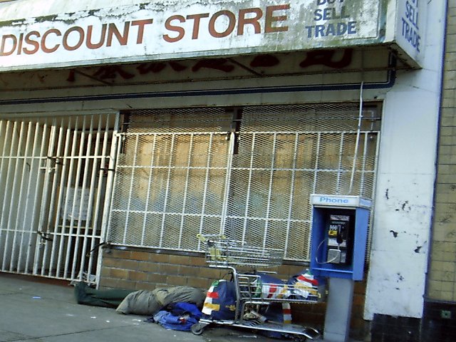
ouch. good photojournalism. i assume the tilt is intentional, it does give a feeling of being off-balanced. did you try bw, just for "mood," though I like it in color as well. karmat
The sideways angle is appropriate to the subject. I hope you don't get too many negative comments about it, since it's obvious it was planned this way.
This is a very poignant image that sums up all that can be bad in the world of capitalism. This is a powerful image of photo journalistic quality. It is sad, it is harsh and a little too real for my liking. When the content is this powerful, it's hard to fault the technical nature of the image, so I don't feel I should. Photographs are supposed to talk to you and this one does – without compromise. I can't say the content is great subject matter, but it does exactly what it is supposed to do – it wouldn't look out of place in a documentary magazine and it fits the challenge. Great work (10) if I could score higher, I would…
I like the slant on this photo - gives it motion - as if we're moving past in a car (which I guess you probably were). The focus is a little off, though. And I think I would crop a little off the right too. Overall excellent picture and title. Well done.
Compression is weak, the angle is awkward/unnecessary and the composition feels uninspired/uncreative. I'm probably being picky (as I often am) but I could almost feel the sadness in this image, and that's what bugs me--the "almost" of it all.
Fail to see how this relates to the challenge. Seems more a reflection on homelessness which could be caused by substance abuse, abusive childhoods, etc, etc, and maybe also somewhat by corporate ruthlessness. Don't like the angle of the store and image is out of focus.
I thought of the same thing, but couldn't find anybody to take a picture of... Focus could be a bit sharper, lighting is good. I like the angle of the shot.
I don't care for the way the image is leaning over to the right, if the vertical lines were actually vertical I think it would look much better IMHO. There is a slight fuzziness to the pic which is not caused by focus problem but by JPEG over compression of the image which causes the unsharp look on the shopping trolley and window bars. The tell tale patterns of this are evident around those black patches on the white pillar to the right of the image if you zoom to 200 - 300 % You may well understand this already but otherwise check out this link which is also in DPC's tutorials section //www.photoblink.com/info.asp?Article=articles/JPEG.xml apart from all that though it's a good subject for the challenge and well exposed
I like the slight tilt to this photo, it adds to the subject matter by having everything a little "off balance" like that. I get the feeling that the sleeping homeless man is going to slide off into oblivion... BAMartin






 Add photograph to your favorites
 Add photographer to your favorites


