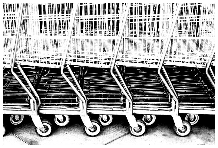
Shopping carts neatly lined up at the CostCo in Goleta, California. Fitting memory of my vacation - I think we went there four times all told. Bought mom a new monitor and Photoshop Elements so it was well worth it.
No idea how this will do - some may find it very overprocessed but I'm quite pleased with how it turned out.
Post processing - desat, smart sharpen, curves, brightness/contrast, levels, resize, add border, touch of levels again.
From the camera jpeg, shot in monochrome, though the challenge entry was processed from the RAW image:
Statistics
Place: 283 out of 684 Avg (all users): 5.7342 Avg (commenters): 7.4667 Avg (participants): 5.7382 Avg (non-participants): 5.7174 Views since voting: 1496 Views during voting: 327 Votes: 237 Comments: 47 Favorites: 15 (view)
Back again looking through this Free Study results to kind of gauge where our Septmeber FS shots might have placed and I had to open yours again. This easily stands out against the shots surrounding it. I think you should have scored better on this one Deb and I just wanted you to know this.
Man - I wish I had been able to vote on this challenge. So much good stuff. This one struck me as I breezed through the entries. A diferent type of shot for a Free STudy and very well done. The processing really takes this way beyond a pic of ordinary daily stuff and well into art - and very good art at that. Great lines, perfect crop and composition and the b&w contrasty feel is wonderful. The 15 voters who gave you below 4 must have been wanting pretty people, perfect landscapes or close up animals and not willing to give it up for something artistically different. Very nice eye on taking the pic and excellent postprocessing Deb. You would have scored very well with me.
This is a definitely a very good work of art, it's a real shame this didn't have greater success during the challenge. At least it is garnering some post-challenge success with all the comments and faves.
Love the patterns and repetition in this shot. The b/w processing is bang on too. It's too bad I never got around to seeing this during the voting...too many entries, not enough time. Great job!
a stunning display of the geometry that surrounds us. Notice how they are individuals yet completely networked together into a greater being... and at the same time you never let us forget the banality of the setting. The high contrast is perfect for this. 10
There are alot of interesting lines and shapes presented in this abstract composition. The only thing that is a major distraction from the visual appeal of the photo is that the image is overexposed/blown out. There is a loss of tonal detail in the upper portions of the shopping carts. Many of the crossbar lines of the basket are a flat one tone shade of bright white. The brightness of the white is almost glaring to view.
Great! I've tried to do this exact shot, but it hasn't come out as well as this. Not sure how the voters will react, that is, if they think it's too processed or too much like digital art, but I like it!!
Composition: 6 - The shapes and crop you've chosed show interesting patterns, but perhaps more of an angle would add more drama?
Technical: 3 - The high contrast works to some extent, especially well at the bottom of the frame, but the top it causes all the whites to blend and just look a bit "mish-mashed".
Creativity: 6 - A risky shot for DPC but the patterns and repetition were well spotted :)
Appeal: 4 - The high contrast black and white is normally something that appeals to me, but this goes a little too far in my opinion.
i like this! the high contrast really brings out the lines and repition of the patterns and it's lovely that you're brave enough to submit something so seemingly mundane for an open challenge. as a visual piece of abstract art i think it works wonderfully, and leaves me longing to see a similarly processed series of supermarket shots. really effective. 10.





 Add photograph to your favorites
 Add photographer to your favorites


 Photographer found comment helpful.


