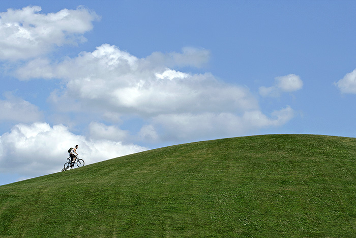
I like the concept and the capture, but certain elements were needed to place this photo in the above average category. First off, the colors are nice and vivid. I like the slope of the hill and the long distance shot calls wonderful attention to the curve. Next the cyclist adds the human interest element - we watch as he struggles to get his bike up the slope. Now to the element that complicates and distracts - the clouds. Had it been a simple blue sky you would have a simple & clean presentation of shapes & colors. For example the composition could have the green grass and the blue sky - and the line seperating them would be the slope of the hill. Shapes and colors would be main players to make the composition visually appealing. Even more so would be the addition of another key player (which you have here), the cyclist. A crop or composition where the line of the hill slope begins just above the bottom left corner and then ends just below the top right corner of the photo would communicate the thought of a steep slope this cyclist must climb. It would also add visual interest to the viewer because we 'see' and observe his ascent to the top. This is a good shot that shows potential because you already have most of the elements there - it is just a matter of how you compose them to create a greater visual impact.
Composition: 8 - Works really well with just enough negative space and the cyclist in a perfect position
Technical: 6 - Nicely exposed, but I feel like it needs just a bit more saturation. The colours look a bit muted when really in this shot I think they'd look great really really colourful.
Creativity: 6 - Nicely done, I like the fact it looks like he's cycling up for no reason other than to come back down :)
Appeal: 6







 Add photograph to your favorites
 Add photographer to your favorites


 Photographer found comment helpful.


