-Noise-reduction with Picture Cooler
-RGB Curve
-Resize for DPC
-USM at 12%/48 dia TH =0
-USM at 12%/48 dia TH =0 (second application)
-USM at 12%/48 dia TH =0 (third application)
-SaveAs JPEG at quality 9/10 = 178kb
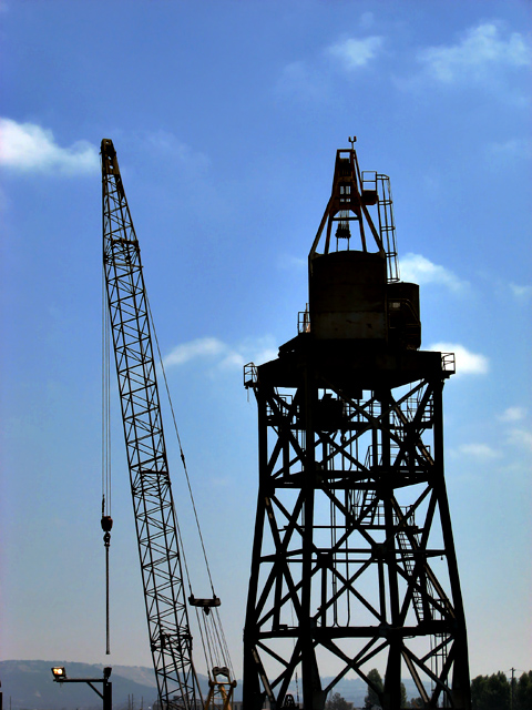
Personally, I'm happy with the composition, lighting, level of detail (wires on the utilty pole on the horizon!), and that I got this shot from the deck of a moving boat ... : )
Statistics
Place: 638 out of 684 Avg (all users): 4.5444 Avg (commenters): 5.4444 Avg (participants): 4.4688 Avg (non-participants): 4.8036 Views since voting: 1233 Views during voting: 296 Votes: 248 Comments: 15 Favorites: 0
I voted this a 6. I was about to hit 5, meaning to me "decent shot, focused, some thought clearly went into it, but not a stunner" when I read the title.
Now, I don't usually like the title to tell the story, but when I looked back up it was just so perfect I laughed. Not LOL laughed, but literally out loud. And that was worth another point. :)
That said, I agree with some of the commenters about missing the ground and the light at the bottom.
I gave it a 5 and here is why. The light at the bottom drew my eye right away. Then the main tower was crooked slightly and I felt it would have been nicer if that would have been strait since to me it was the main subject. The clouds around the tower also were not in the ideal position. They didn't add depth but detracted from the detail of the tower in my humble and non-expert opinion.
I didn't vote on this image, but here are my thoughts:
I think the best silhouettes are the ones that, in spite of their lack of frontal detail, still manage to tell a story. In looking at this image, I can't really tell why you would want me to look at the crane... there's no story here. Well executed, yes. But (I hate to put it this way): boring. (really not trying to be rude, what I mean is, I don't feel compelled to look at it and study it they way I do a stronger silhouette image)
Since you grumbled in the forums here is why I gave it a 5 on par average vote:
I simply miss the ground. Now the objects hover on the bottom of the frame. The result is that there is no real depth in the image either. Sure, the mind knows that the crane is at an angle, but because of the lack of depth on the ground and the silhouetting there is no scale to judge it against.
The sky look blotchy and noisy/ noisy gradation. It also looks like a long focal length compression even further enhancing the lack of depth.
I like the idea of silhouetting this and the color is good.
-funny title
-wish the subject matter was a little more interesting... or perhaps if it were composed in a more creative way
-nice blue in the sky
-score: 5







 Add photograph to your favorites
 Add photographer to your favorites

 Photographer found comment helpful.


