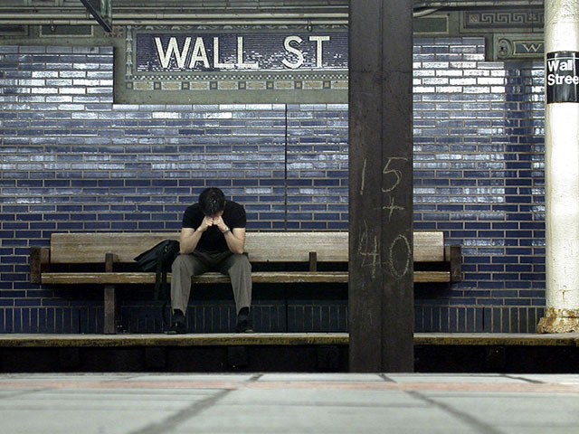
This is a brilliant photograph. It captures much of the emotion that people are expriencing with the stock market/economy. Do you have the original high quality version of the photo online anywhere? I would love to make a large print of this picture.
This is definitely the most dramatic and moving image throughout the existence of man. Words cannot describe the pain of loss and the triumph of good over evil that is captured in this digital masterpiece. Only a sigh of empathy and a shake of pity can sum up the emotions that this image leaves behind. The lone figure in the middle is the heart and soul of this stunning success. His firm biceps and sinewy forearms accentuate the struggle of man versus himself. Like a fallen angel, he brings the only human touch to an environment that has been defiled by greed and corruption. Perhaps one day, he will find his wings and ascend from the horrible existence known as everyday life. Bravo dequinix for the serving this bitter slice of capitalism pie and to you Mr. Model, whoever you are, you deserve an award for being the perfect depiction of the human condition!
Thanks for all the kind commentary. I was thinking of what to say in response to all this, and, well, I said it on my website. So, here's some cutting and pasting:
"I find it very ironic that the very first time I do well in DPChallenge is when the topic is "The Corporate World" and its effect on society. And not only did I do well, I actually get first place—a week after coming in 198th out of 218. I'm quite glad.
"The idea behind the photograph is simple: For all the joy and happiness it has brought, the rise and fall of the new economy has equally welcomed grief and sorrow. The man is supposed to symbolize the prime catalyst of this boom: the Wall Street analyst. At 3AM one night, while waiting for the subway, he realizes that, "Wow. This is it. This is my life." And that causes him to go into a state of sadness. Because after all, when the dust clears, his ability to do derivatives is as important as his ability to add 15 and 40 as long as it's done with a strong sense of ethics and integrity.
"To thank: Josh Li for the camera, Alex Pan for being a model in the wee hours of the morning, John Han for the backpack and Langdon Oliver [and Drew of course!] for an absolutely great website."
Congrats to the win, Rahat. You mastered a very difficult challenge! (P.S.: in my comment below I mixed left and right. Of course if should mean "if you would have moved to the left", not right. I should sleep more %-)
I see the comments on cropping to the left on this photo and I have to say you made the right choice, I love it as is. I think it is better to beat people over the head with things and the added wall street there just helps. GREAT JOB, I love this picture, e-mail me and let me kno if I can buy a print.
very very nice photo! captures a nice mood. good angle you've chosen. unfortunately there is something which bothers me a lot. te me the photo just screams to be cropped more on the right. the white pillar is so distracting because it's white and the rest of the photo is more dark. another suggestion: if you would have moved more to the right, the lines on the floow would have pointed right to the man. at the moment the lines lead to a point right next to him. if they would point directly to him that would have been more effective, anyway. the photo is still one of my favourites this week. it's original and has a nice mood.
Nice capture. The only thing that I don't like is the I-beam thingy on the right third. Of course, I understand without it, the whole place may have crashed on your head. Otherwise this picture has a very powerful message. Just curious (doesn't effect score) was this posed, or did you just find it? karmat
I think I'd like this a little better if you had taken a couple steps to the left. The support beam is a bit too close to the center for me, and the white pole on the right makes it feel a little cluttered. I'd like more empty wall on the left. This is assuming, of course, that you didn't frame it this way to avoid a bright red poster on the left. ;-)
perfect composition. - although i want the guy a little more the left, maybe more under the W. i also wish t he colors were a tittle bit more saturated or unsaturated. right now it's sort in between. mag99
Excellent photo and meets the challenge very well. I'm rating this as one of the my four favorites this week -- only real negative I have (and you may not have any control over this) -- I think I may like this better if the Wall Street sign in the middle of the photo were more to the right, with the big steel post on the far right. I realize that this would move the Wall Street sticker off camera (the one on the white pole to the far right). Of course, that is assuming that there are not elements to the left that you are trying to keep out of the frame! Great work!! LanSnake
awesome. like the framing and the bland color scheme seems to add to the depressive atmosphere of the picture. Can't decide if I'd crop the column on the right out or not...anyway you get a nine from me! 9--amitchell
This one is great. I love the colors, the position the man is in is simple and tells the story clearly. Obviously where you took this photo was the main thing.. its' great.. 10! Maybe for your personal portfolio you could PS out the 15 + 40 on the post, it does distract a smidge. .but still .. 10 for you !!
I know it's hard to get good lighting conditions in a subway, but it would have made the image more interesting. The glare on the bricks looks like it's due to a head-on flash. Otherwise interesting photo.
A wonderful interpretation of a very difficult challenge. One of 2 10s this week for me. I like the compositon, and although I've debated with myself, I like the foreground floor. You've captured the moment in time.
cool shot, I like the cold colors and the framing you chose - plus it's another one of those MTA/NYC public transportation shots I like to do myself... 8 beegee
This is a great shot, body language shows tention/effect on society. Wall Street, of corse shows corporate world. This is my #1 pick for this challenge.
This is great! I love it. It has a hip feel to it and the composition/balance is incredible. Also like the limited number of colors in this. My one small nitpick is that I'd like to see it cropped up a tiny bit. 9 Lisa





 Back to Basics
 Add photograph to your favorites
 Add photographer to your favorites


