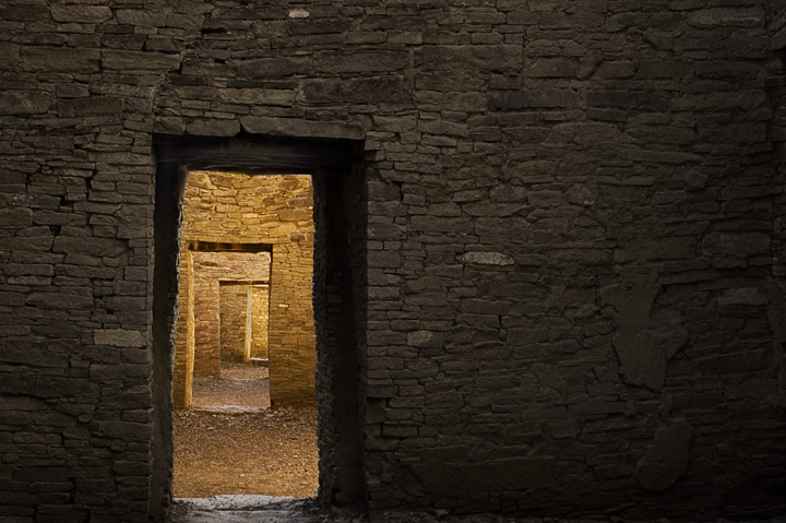
Very nice composition though I would of liked to see a little more on the bottom and a little less on the top. As it is it feels a little chopped off on the bottom.
I'm a sucker for doors opening to other doors. I don't think I want the foreground wall to be so dark. I want it to be more a part of the pattern, so that I feel it continues behind me as well as in front of me. 7
I like the perspective in this composition as the eye 'travel's through each door to the 'vanishing point' off in the horizon. I like the golden colors that we encounter after we step out from the darkened quarters of the first door. It is the promise of light that beacons us out of the dark. I like the textures of the stone that we see in the wall because that also adds visual interest. However, even with those strengths, the composition can and needs a presentation that adds a fresh look at an old idea. I look at the composition and see an avenue that you could have taken to add even more visual interest to the image. A crop that is vertical rectangle and not a horizontal rectangle would have 'mimiced' yet another door that the viewer has to 'pass through' before we see the very first one pictured here in the foreground.
Looks a bit like Aztec Ruins, or maybe Chaco (can't quite remember either as it's been a while!) Nice composition and light. The only thing I want is a bit more of the doorstep.






 Add photograph to your favorites
 Add photographer to your favorites


 Photographer found comment helpful.


