Author Thread Comments Made During the Challenge
Post actions
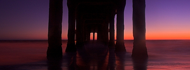
I like the color gradient on the right side and how it fades to left. It would be nice to see more of the structure. 6
Post actions
Nice colors. The front two pillars on the right seem to have some effects from light scatter which detracts (IMO) from the impact.
Post actions
the colors look very pleasing. nice composition.
Post actions
Love it :o) Have done similar pictures myself... Good colors..
Post actions
i think the top looks a bit incomplete. did you crop it off?
Post actions
Post actions
Very nice! I only wish you would have made the image closer to the max size because i want to see more. Very nice indeed!
Post actions
nice colors, a little dark, and the crop seem tight on top.
Post actions
nice color..I wonder if this is basic editing? Probably is! 7
Post actions
Well done, great light, comp., and exp. 9. Just re-bumped you up to a 10 on my second go through! Love it!
Post actions
where is the rest of the picture? I like the colors.
Post actions
Good picture, but I kept trying to scroll up thinking my browser was cutting off the picture. Maybe a small border around it if keeping this aspect ratio?
Post actions
Um, WOW! Amazing tones you've got going on here. Wish it were a tad larger width wise, but still, nice work!







 Add photograph to your favorites
 Add photographer to your favorites


 Photographer found comment helpful.


