Critique Club Review:
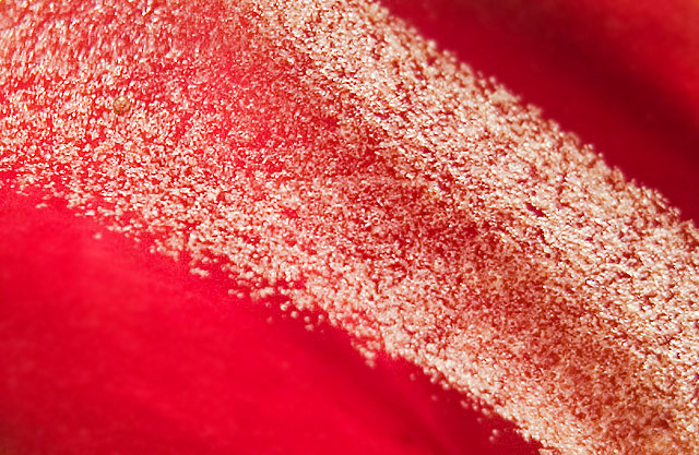
Evidently abstract work just isn't appreciated as it should be. The exposure, saturation, contrast, color and hues all work well. I'm not sure if the red bits needed to be blurred. Haven't seen the original. The piece is well lit, and focused. I think a little more depth of field would have been beneficial, as the bubbles along the edeges of the stream top and bottom are a bit soft. Good use of lighting as the bubbles have a lot of texture to them. Fits the challenge quite well. I like this photo, and had I voted probably would have gotten an 8 or 9 from me. Good job! |




 Add photograph to your favorites
 Add photographer to your favorites

 Photographer found comment helpful.


