Hello from the Critique Club.
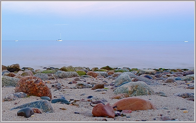
I think you chose a subject for this challenge with a lot of potential. The pastel colors in the background are very effective at keeping the image subject neutral. However, being lighter than the shoreline, my eyes tend to want to rest on the rocks, which is your intent. But the rocks don't have enough punch to them and could be lightened just a bit. I think a little work in post processing with either curves or levels could help balance this image. Once the rocks have more pop, I would suggest that you try a few different crops (less sky, remove the two boats on the ends, or both) and see how the mood of the image changes. You have a good eye for composition and I look forward to seeing more of your entries.
Feel free to PM me if you have any questions regarding this critique.
Tim
|






 Add photograph to your favorites
 Add photographer to your favorites

 Photographer found comment helpful.


