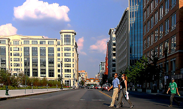
The composition here is quite nice actually. I think this challenge sucks in that every photo has a subject, and this one does as well, but I'm just ignoring the subjectless nonsense and voting on the photos for what they are. Processing - it is way, WAY too sharp. You need to back off the amount of sharpness or use a much smaller radius setting (or both). I like the colors being presented here. I think some extra work with curves to acheive a slightly stronger contrast between elements might also work well. Overall this is a very nice photo, it's just the PP that needs some extra attention. Very nice.
I think that the people crossing the street, namely the couple, are the subjects of this photo. My eye went straight to them. Aside from that, the image appears to be oversharpened.




 Add photograph to your favorites
 Add photographer to your favorites


 Photographer found comment helpful.


