Couldn't travel this month due to a busy schedule. I always like to use a Free Study as an excuse to travel to the coast, but it was not to be.
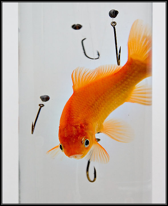
I've wanted to do this shot for a while. Finally managed to do it. Quite simple really. Dorothy, Caden's goldfish, was a willing participant and unharmed.
Statistics
Place: 193 out of 684 Avg (all users): 5.9416 Avg (commenters): 6.5161 Avg (participants): 5.8732 Avg (non-participants): 6.2115 Views since voting: 1620 Views during voting: 385 Votes: 257 Comments: 36 Favorites: 0
Cute image. have a couple spects that might should have been taken care of. But eveyrthing seems to work here... Except maybe the right and left open edges. To me it cuts the image off short and makes me feel cheated.
Like a long-tailed cat in a room full of rocking chairs!
I don't like the border, and it seems to be outside of the actual edge of the image by quite a bit. The way it is presented almost makes it look like a picture of a page in a book, though I suspect it is caused by a slightly dirty glass or tube or whatever the fish is in. It would be improved by cropping to the edge of the container or slightly inside it.
The exposure isn't bad but this don't work for quite a few reasons. People don't fish for goldfish. If they did they would use bait. A fisherman wouldn't put the splitshot so close to the hook.
Great title and creativity!!!! Love the set-up of the elements that make up this humorous photo. While the lighting on the fish and creativity are excellent the composition and execution of the shot needs improvement. I really think you could pull back and show us the glass so that it creates a greater impact to the title. It will show just another way that the odds are stacked against you. Next the water in the glass and the background could be clearer and brighter. The background white could be whiter and that can be accomplished through selective editing to bump up the contrast. Hmmm, maybe even play with the Brightness/Contrast tools to see if you could get the whites looking whiter rather than dingy and dull. I think just one fishing hook perfectly poised so that you can see the curve of the hook would be much better than the numerous ones you have in the composition. The reason? Simplicity sometimes is the best presentation. In my honest opinion, too many hooks is overkill on presenting your idea.
I really hope that you go back and reshoot or touch up this one for it really is a great concept.






 Add photograph to your favorites
 Add photographer to your favorites

 Photographer found comment helpful.


