i used frankenthaller's staining techniques in a series of huge paintings i did in botswana. sadly, there are no images of these, as they were lost ina fire, including all the slides of the work and from the show.
alright! lowest score yet!
Photoshopping:
pretty basic, really.
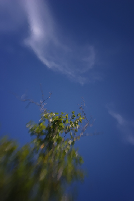
layer - glass distortion filter,
multiply layer, masking
reduce size
save for web
Statistics
Place: 226 out of 241 Avg (all users): 4.3269 Avg (commenters): 5.2000 Avg (participants): 4.2169 Avg (non-participants): 4.4521 Views since voting: 959 Views during voting: 214 Votes: 156 Comments: 9 Favorites: 0
Tough challenge, and a tough piece to critique. To my eye, the effects observed were obvious goals, as opposed to accidental creations. Which reading your comments reinforces. I really like the colors and patterns of the sky.
The green of the vegetation, and the focus/pattern used there is not very complimentary. Nor does it seem to contrast quite enough. To me it sets up more of a contest, distraction, and confusion. I think either one would have been a good basis for the start of such a piece, but do not work quite so well together.
I would love to see more sky and cloud patterns, or more of the green against a different background. Or even a lighter green, more smeary (is that a word?) to compliment the watery flowing look of the clouds.
Over all the exposure, color rendition, saturation, contrast, exposure and hue are well done.
The lack of focus at the bottom, or the itermediate focus in the middle (not sure which) is distrcting. I expect it is intentional, and I don't know who Helen Frankenthaler is, but the effect looks poorly excecuted as opposed to an intentional abstract presentation.





 Add photograph to your favorites
 Add photographer to your favorites

 Photographer found comment helpful.


