Hello from the Critique Club.
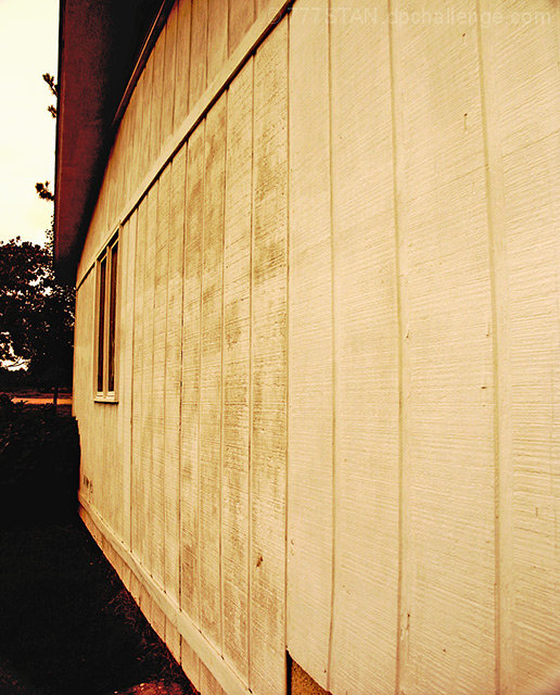
I think you chose a subject for this challenge with a lot of potential. The texture of the wood siding would have provided a pleasing area for the eyes to wonder if the texture was consistent across the whole image. The glare on the right side of the image hides the wonderful texture and might have been prevented if taken at a different time of the day. As is, the right side is a little harsh to look at so my eyes are drawn to the left and coming to rest on the window. If you decide to re-shoot this image in different lighting, I would suggest a tighter crop to eliminate the non-siding portions of the image on the left and at the bottom. The texture and lines of the siding are perfect for a No Subject image and eliminating the background clutter would strengthen their appeal IMHO.
Feel free to PM me if you have any questions regarding this critique.
Tim
|





 Add photograph to your favorites
 Add photographer to your favorites


 Photographer found comment helpful.


