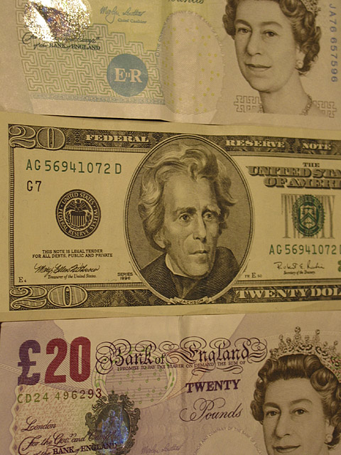
i think this might have been more effective if you had used a horizontal frame and used te bottom half of the American 20 and the top half of the English 20. karmat
It's a pity you didn't get two "fresh from the mint" British notes to go with your crisp dollar bill. The folds down both notes spoil the lines. maybe you could have ironed them. The colours look a bit odd also and it is generally dark. There is a lot of room for movement a the bottom end of the level histogram to bring some light and life into this.
It's a sharp, well lit and crisp image and has a lot going for it. Although, I think it lacks creativity, it is one of those pictures that I am uncertain about – many people may really like this picture and perhaps I am going to be proved wrong…
Nice "money" shot. Very clear. Money to world corporation is a small stretch, all by itself, but I am flexible.....I would have liked some more direct connection, but as presented here, I can't think of any suggestions. I am still going to give you an 8. Swash
I think if you're going to go ahead with this type of layout, it would be better to have them all totally flat. In the end, I do this the perspective angle definitely helped the image.







 Add photograph to your favorites
 Add photographer to your favorites


