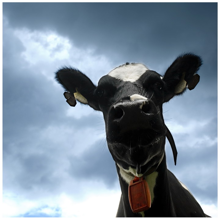
Well this in my best of august! Right after I made it I sold it, to.....bite me (Han)! I showed the muts my pic and she needed a pressent for her friend.
I printed for myself on metalic paper and it is really WOWY (just got it. So I thought that must be it!)
Post processing:
layer filled black --> soft light. With 50% gray, white and black I "dodged and burned"
Color and saturation
Usm, noiseware pro
Edit:
Thanx everybody for so many nice comments (broke a record!:D)
A lot of comments metioned the fact that the face is to dark, but on the computers at my home (LCD and CRT both calibrated) you can see the eyes and even count the hairs on her nose, including a fly.
I've got a print on metalic and it looks great.
I'm curious if every body calibrates their computers. My LCD has backlights so everything is quit bright on my screen. But The CRT is a bit darker.
Maybe I should think about the fact that not every body has his screen calibrated and make the web pictures even a bit brighter.
Statistics
Place: 55 out of 684 Avg (all users): 6.3678 Avg (commenters): 7.7317 Avg (participants): 6.3990 Avg (non-participants): 6.2586 Views since voting: 1782 Views during voting: 381 Votes: 261 Comments: 49 Favorites: 7 (view)
A lot of comments metioned the fact that the face is to dark
Just to clarify my comment. I can see the eyes, but only just. I just felt that they needed bringing out a bit more. I have a reasonably well calibrated CRT btw.
I think it's the backlighting causing the eyes to be in shadow rather than the overall brightness which is the issue on my monitor so don't worry about it too much.
Interesting angle. I think the cow is too shadowed, though. To get the sky so nicely kind of affected the exposure of the cow. Did you try adjusting brightness on cow to give more detail, in post processing?
This is a really great image. Might look into sellin it to the National Dairy Industry or such. Very wll done. Just maybe a touch lighter in the eyes to make them more visable.
I really like the unusual angle that this is taken from. It really adds visual interest to this picture of a cow. Square crop keeps the main subject the focus of our attention. I look at the title and it innvokes the idea that ol' bettsy is just a number (0860) from a very large farm of cows that you cannot see in the picture. It calls up the idea of this cow being just one of a large herd all the while it depicts it as an individual in the photograph. The critique I have on this photo is that the lighting on the cows face is too dark that one cannot see it's eyes. They say the eye's are the windows to the soul - and when it comes to establishing a connection or human interest to a photo of a person or animal it is the eyes that can really grab & hold the viewer's attention. Perhaps an slightly slower shutter speed or lower ASA would have let more light come in to illuminate the eyes OR you could use selective editing to up the gamma, brightness & contrast just around the eyes to get them to be more visible.
Class. Almost made me jump when it popped up!
Could do with a little shadow recovery to bring out some detail. Being able to see the eyes would certainly add to the effect. Also, now that I've scrolled down and can't see the top of the shot I think I prefer it this way. The space at the top takes away from the impact if anything.
Great stuff.
I really like the perspective in this shot. The shadows seem a little blocked on my monitor, but not too badly and there is some detail there, so I didn't take off for it. Monitors differ. I wish there were a bit more catchlight in the eye to bring them to life, and make the dark eyes easier to pick out from the black cow face. Very cool and quirky shot. 7 from me.
What a fun angle! I love the sky but would like to see more detail in the shadows on the cow's face. This must have been difficult difficult exposure-wise.
hahahahahahahahah... :) :) I like how you processed this. If you want to make her face lighter, try fooling around with the channel mixer and shadow/highlights, if you have photoshop.
oh yes, i adore this! this so sweet and adrable. the angle this is taken from is superb, and very funny. i do wish that the sky wasn't quite so white at the bottom because the greyish blueness is really beautiful and looks great against the blacks and white, but that aside, really lovely stuff. the title is the proverbial icing, really. 9.





 Add photograph to your favorites
 Add photographer to your favorites


 Photographer found comment helpful.


