Critique Club Review:
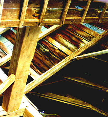
As you have already read, the smaller images do not do well in a challenge. You need to make it is large as you can, and still stay within the size limitations. Same goes for file size. The more bytes in the file, the more info in the picture, resulting in a better representaion. Some of the sufraces, lower left, are completely burned out and devoid of detail. This is a picture where being able to see the texture of the wood, would have really added to the piece. I like the juxtaposition of all the different angles. The lower right may be just a little bit dark, as I feel that a little more light there would have made it a little less heavy and added to the opposing angles theme. |





 Add photograph to your favorites
 Add photographer to your favorites

 Photographer found comment helpful.


