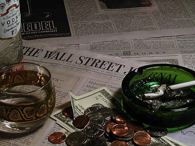
Wanted to give this picture a dark murky feel...That's why the lighting is dull (probably explains all the "too dark" comments I got). This was set up on my kitchen table with ambient lighting from the porch window and a desk lamp I held with my hand. I changed the location trying to get the best lighting. I don't think this was a complex scene. But i think it meets the challenge.
Statistics
Place: 34 out of 116 Avg (all users): 5.3374 Avg (commenters): 6.6400 Avg (participants): 5.3034 Avg (non-participants): 5.3567 Views since voting: 1254 Votes: 246 Comments: 26 Favorites: 0
I like the idea, I like the overall atmosphere created here, but the composition seems to lack a central element. This might seem a little pedantic, but the ashtray (in my opinion) should have been the central theme and not the words on the newspaper. My main suggestion would be to have treated the newspaper like wallpaper. Everybody knows Wall Street and the journal, so only seeing part of the words would not have detracted from the image theme. Having said that, technically, it's fine and I really like the lighting. Good luck…
interesting image... I can't really see much room for improvement on this one. I wonder what it would look like if the papers under and behind the 'wall street journal' were removed from the image to show a wooden table top? ... just a thought.. The glass is a nice touch. I think it would work nicely with a completely clear glass filled with ice and a brown whiskey in this image :) good work.. - jmsetzler
Pretty nice. possible improvements...a little more light...maybe the glass tipped over with vodka dribbling out to indicate you stumbled away in disgust...a few more butts. I get the all your money's on the market thing and I love the play of lights on the loose change...but that also shows that you have some cash. so, maybe the money could have stayed out. 7 Lisa
You are effective in getting your message across here but you are not doing it in a particularly beautiful way. Don't care for the composition, particularly the top two pages of the WSJ and all that change. The change is in the foreground and too dark and out of focus. With fewer objects and a better arrangement of them you would have had a much better picture. Good idea though.







 Add photograph to your favorites
 Add photographer to your favorites


 Photographer found comment helpful.


