*Critique Club*
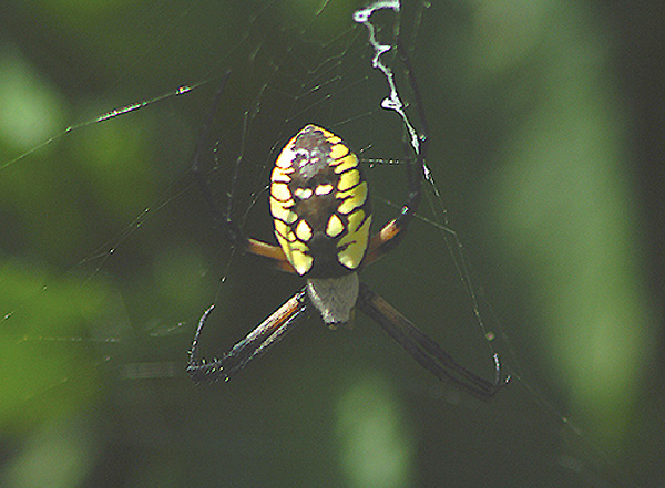
I think that the thought is here. The spider is definately interesting to me. I like that he's on a simple background.
The colors seem dull and muted to me though. By the harsh highlight on his back, i'm assuming that this is because of the lighting. Saturation and contrast adjustments could definately help to bring this out.
Ideally, a different time of the day might be a better decision, however, with live animals, you can't exactly ask them to come back at a different time, so sometimes you take what you can get.
The focus is a bit soft, which could be from the lighting, or it could also be that maybe it was moving slightly?
I think that the best way to get a great shot of something like this is to take LOTS of shots. It's digital, so we don't have to worry about wasting film. Just go crazy, take like 70 shots of the exact same thing. At least one is bound to be in focus, or have just the right angle. Then you can mess with color and contrast later in an editing program.
The angle is ok. Maybe a bit too head on, but still not bad. I do like how you have blurred the background, nothing distracting there. Overall, crispness, and color would have made this shot really good.
~Heather~
With a bit more sharpness or contrast you could really bring out the spider. The blurring of the background helps, but the spider needs more to really make it pop out of the pictue.
Too much negative space, not crisp enough. Maybe try a subject more abstract/artistic that you can manipulate. Because I know I sure wouldn't want to touch this guy. Eep!






 Add photograph to your favorites
 Add photographer to your favorites


