|
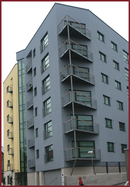
interesting... I think this photo has several issues... 1 - the cropped person in the lower portion of the frame is quite awkward.... 2 - where does this tie into the theme of 'at rest'? This, to me, looks like a case of trying to use a title to squeeze a photo into the challenge where it simply doesn't fit. 3 - the border color you chose here doesn't seem to fit at all. it's not a similar or supporting color for any of the colors within the photo. |





 Add photograph to your favorites
 Add photographer to your favorites


 Photographer found comment helpful.


