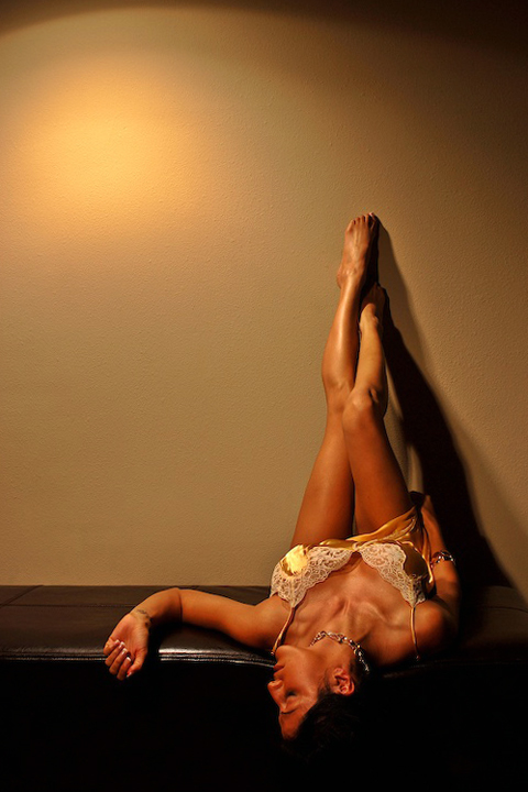
Focus and depth of field are a little off. f10 should have given you a sufficient depth of field, but the torso and legs look sharper than the rest of the image.
Color, saturation and hue are good. Lighting is a bit harsh, resulting in a highlite on the wall that competes with the rest of the image. It is so different and brighter, that it makes the color look off, over the rest of the photo. If I cover the highlite, the rest of the picture looks fine.
About the only arguement I have with the pose, is the furniture. With the model looking down a long piece of furniture that leads out of the frame, the eyes are drawn along a path that goes nowhere.
Overall a good picture, and nice job. Congratulations on making the upper half of the class in a tough challenge.
Nice shot and setup. Something is "off" between the light's color, the wall color and her skin color, may have been better as a b/w? Wish her face was in sharper focus too. Still a great image!
I like the idea and pose of the shot with very nice lighting. My only two complaints are the spot on the wall being too distracting and the space above dosen't really help the image. I would crop almost all the way to her feet thus, almost elminating the spot and also bringing your attention to the subject more easily.
Beautiful lighting on your model. It flatters her and brings out the curves (which suits your mood very nicely) and I love the shadow making a triangle with her legs. Nice composition and tones throughout. On my monitor (which is calibrated) you have lost detail in her hair and it has no seperation from the furniture. I don't like the hotspot on the wall in the upper corner. It draws my attention away from the subject. 7 from me.






 Add photograph to your favorites
 Add photographer to your favorites


