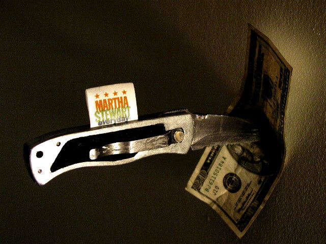
I think if the lighting was more even, the right side of the knife and bill would be more in focus, and the whole picture would be more effective. Great idea. karmat
Very sarcastic. I initlally submitted a photo along similar lines but decided it was to sarcastic and didn't know how it would be taken.I chickened out good for you to stick with your conviction.
I like the title, don't quite get it, but thinking isn't my strong suit. Photographically, it's an odd mix of too dark, with some too bright spots, like the end of the knife handle. (Until has just one L, I think) Shine more light directly on the $20, in line with the knife, that should still display the knife, and show off the bill more. Was the Martha Stewart label an manufactured prop? I still haven't figured out how to light the label, the knife and the money without hurting one of them. 5 Swash
Don't understand (although am aware of the Martha $'s insider trading scandal). Sorry. Image is very dark. You probably did that deliberately but this dark? (my monitor is calibrated okay)





 Add photograph to your favorites
 Add photographer to your favorites


