|
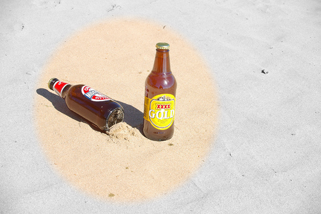
The desaturation really detracts from the image for me. I get the point, but I think your composition and the word gold on one of the beers would've been sufficient and good. The composition, colors (but not the circle part), and the idea are are quite nice - so I don't mean to rake you over the coals regarding the desat thing. It was just that that was all I noticed in the beginning. Now, after spending some time with this image, I'm getting thirsty! |





 Add photograph to your favorites
 Add photographer to your favorites


 Photographer found comment helpful.


