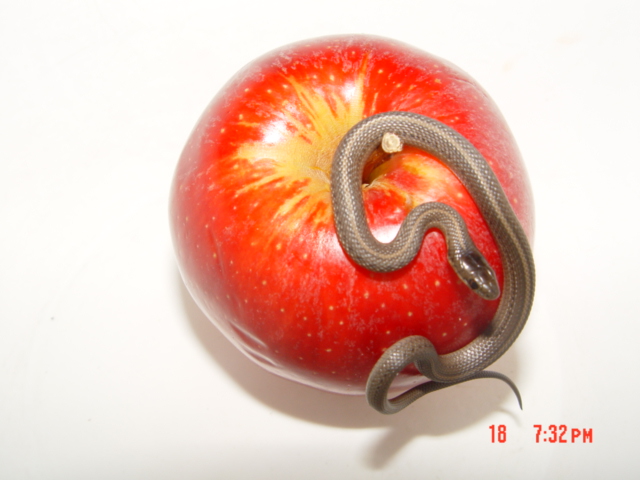
great idea and background, but it is a bit too bright all around. deeper tones and touch darker would bring the snake out more and look a lot richer in color. little soft focus on the snake where it should be sharper
I'd always pictured the Genesis serpent to be a bit bigger. This image has a lesson for those that believe in Genesis: small temptations are as bad as big ones.
But on to the photo: I really like the way the snake is posed, the inclusion of part of the snake in the shadow, and the conrasts in color and texture between the snake and apple. Well focused and good composition. Some sharpening would help bring out the textures.
Great picture! Cood composition! Great lighting! I would have turned the apple so you wouldnt see the bruises on the side! Is there any way you can turn off your date and time?
Wow that's a tiny snake... good job photoing it with the apple because that gives you a sense of "up close" and "macro". If you just took the snake itself, there would be no way to tell. You could have gotten a little closer as well. Turn off the camera's auto-time stamp thing. :)
Awww, (s)he's a cutie. Nice idea! A more diffuse light source would have given a more pleasing result here, I think. The snake's head is also a little out of focus. His head should be tack sharp for maximum effect. Also, turn your date stamping off; it does detract. Good Luck!
I hope you're going to turn off the date function in your camera for the next one... Interesting photo, I love how you've got the nackground burnt out. Interesting crop, works well here in my opinion. Think it could do with some significant sharpening to bring out the textures in the snake. Shame about the high levels of glare on top of the apple. Score: 6, but these issues could have raised the score easily if fixed.
Yep, you wanna grab the manual and turn that timestamp off. I also would have shot maybe from below, and have the snake looking down at you. You also want to choose props that are going to look really nice and yummy. This apple looks like I would want to wash it off before I ate it (you know, besides the fact that there was a snake on it).
I looked at this about 10 times, trying to decide if it was a 10. I decided that the colors are washed out and the focus is off. Would have liked it better if the snake's head was the focal point. Excellent idea and worth persuing.
very good idea, im guessing you were told a bunch of other times about the date stamp on the picture. Good compsition, a little bright on my monitor, but that could just be me. I wonder what it would look like if the snake wasnt falling off the side too much, but i gues you cant really do too much about it
Nice picture, but the timestamp on the picture REALLY detracts from it.... You might consider turning the timestamp off before entering another challenge.
The idea is excellent and the placement of the apple and snake are very good, but the focus is a bit too soft and the date really shouldn't have been there.
Nice shot even though it gives me the creeps (I hate snakes!!) Anyway I like the position of the snake on the apple and red apple on the white background really makes it stand out, but I think you should have turned the time date stamp off your camera but I am sure you have heard that plenty already.
Nice idea. I would have shot this against a black background (darker tones would have conveyed more emotion, IMO) and would have shot this at a less steep angle. I encourage you to play with this subject if you still have that beautiful little snake. I LOVE those guys. The date in the lower right corner is very distracting. If you can't remove it through camera programming, try cropping the image to leave it out. Keep up the good work.
Great concept. Only thing (and I guess you hear this alot) I see wrong with this shot is the timestamp, might be impossible to remove it? I would have zoomed out a bit and crop the timestamp away.
Cute idea and a lovely little snake. Shame about the time code and the softness of the focus. A little Unsharp mask would have helped. Good composition.





 Add photograph to your favorites
 Add photographer to your favorites


 Photographer found comment helpful.


