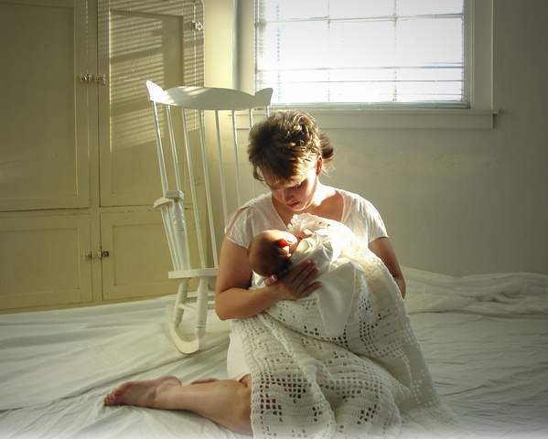
This shot was taken in an old building, of a mom and her newborn son. Everything about the shoot was serene and calm, and the mother kept softly singing. It really was a wonderful photo shoot.
Statistics
Place: 19 out of 288 Avg (all users): 5.8927 Avg (commenters): 7.3636 Avg (participants): 5.9194 Avg (non-participants): 5.8624 Views since voting: 1916 Votes: 233 Comments: 24 Favorites: 0
Good concept, like the light. Don't care for the floor covering. Need to compress less, there are JPEG compression artifacts that are noticeable. Your file size is only 28k, you should try for nearer to the 150k size limit.
A beautiful picture, lovely atmosphere has been captured. It's a shame about the burnt out highlights on the mother's face and the shawl. This is acceptable from the window, but not from the subject of the photo!
I can't help but feel that the composition isn't quite right. I'd have liked the subject definitely not centred, and there seems to be too much negative space relative to the subject. It implies that the photographer thinks that the viewer's eye should spend plenty of time taking in the background, but there's not enough interest there to warrant that. 7
I kept postponing voting on this shot because I wanted to give it proper attention. I think it is a very sweet pose of a loving mom and baby. I like the choice of all white clothing, props and background with varying textures for contrast and I like the use of natural light although I think the shot could have been exposed better. The overexposure from the window and on mom's neck and the baby's elbow is unfortunate. Mom's leg seems kind of splayed out so that she doesn't look like she is in a comfortable position. All that aside, I'll rank this a 6 because I appreciate what looks like a reasonable attempt to make a very special portrait. I think tighter cropping, keeping parts of the window and rocking chair, but focusing on mom and baby, and controlling the light better would go a long way toward making this a great shot.
Good concept. With a little more work, it could be really sweet. The window and background is distracting. It looks like you wanted the light to be falling on the baby, but you didn't take into consideration the effect that the background would have. Maybe, next time, if you get in closer, you can cut out most of the background. Also, the baby's color is blown out.
I love the picture and all the cream colors. My suggestion would be to crop the picture to right above the chair. That way you still get the sensation of the sun and the shadows without all the glare.
Challenge met, composition is good, lighting is well done, the only negative I see is the window is a bit too blown out with the light, otherwise a top notch photo







 Add photograph to your favorites
 Add photographer to your favorites

 Photographer found comment helpful.


