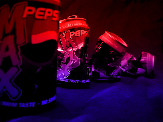
I really wasn't quite sure what to photograph for this challenge, so I kinda came up with the idea that large companies just keep getting larger and larger and larger, eventually leaving companies (however much smaller) behind.
Statistics
Place: 29 out of 116 Avg (all users): 5.4418 Avg (commenters): 6.9000 Avg (participants): 5.1685 Avg (non-participants): 5.5938 Views since voting: 1490 Votes: 249 Comments: 24 Favorites: 1 (view)
The lighting was done useing a red and a blue filter over a flash unit..??.. I was playing around with a minolta flash unit and some large metz flash filters and lit the whole room up red and blue..just like in this photo... Looks like the local police have just arrived (they use alternating red and blue lights here in New Zealand) hehehe :-)
O.K. this is a symbolic message...(But you didn't do a very good job of it, Pepsi is still out there, advertising like mad! joke) Did you want to display the first and last can out of focus? If so, why? Suggestion (lousy one): Could you have gotten a Coke VP out to crush the cans in the pic for you? I'm not wholly thrilled with this shot, but it ain't wholly bad either, so I started you as a 7, why don't we just stay there? (cause I said so) 7 Swash
I like this one, but it reminds of a games arcade because of the way it's lit. Clever use of DOF to pull in a central point. Overall, not a bad picture - good luck...
Cool lighting. These cans look, to me, like they are out on the town, and out on the dance floor. Any pop art fan would love this. Had there been a little white in the pic, it would be down right patriotic. Score "8" from me! Gracious
Coca-Cola strikes again! The red/blue filter effect is nice, but it doesn't add much. The depth of field is nice, as is the line of gradually crushed MAX cans. I wonder what this might have been like without a studio background, but rather with a shot of a rival cola distributor in the background.
Cool interesting colour and lighting. Very dark though. Not easy enough to see the last couple of cans. I guess they're supposed to be getting more crushed as they go into the distance. Not obvious enough, though.
This is pretty cool. I love the red light. Although this would ruin your 'crushing' message, I think it would be neat to do the setup in reverse order. The crushed cans in front might be a little more interesting (not that this lacks interest). 8 Lisa
I don't really understand the shot or how it relates to the corporate world. As for the shot, s'very interesting lighting, but I think your DOF needs to be increased to focus in all 4 cans...try playing with your aperture.





 Add photograph to your favorites
 Add photographer to your favorites


 Photographer found comment helpful.


