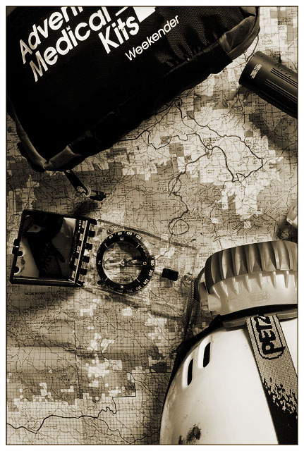
I like the sepia tones and the whole idea of the photo. I think the kit is a bit large to be on the top of the photo. Maybe shooting this as a lateral photo would mitigate that aspect of the shot.
Nice work with the tones. The medical bag at the top makes the picture a little top-heavy to me, but I do like the idea and it's well executed - great clarity of the map and the objects.
Trading post...
I gave this a 6 in voting. I like the lack of color, it really makes the map stand out. The placement of all the objects is nicely done.
I think there's a little too much in this image. The helmet thing in the lower right distracts me quite a bit, because I can't really figure out what it is. Likewise, there's some kind of a cover attached to the compass that draws my eye away from the map. I think the map is the main subject, but all the other objects in the frame make me unsure. I do like the tones and clarity. I also like your idea.
Nicely setup, arranged and balanced across the frame. Lighting is good. Sepia makes a nice choice for the image. Of course, I had NONE of the items you framed and could have used all of them! It is also apprpriate that I do not recognize any of the locations on the map. Didn't know where I was when there! Great job. - Steve
I really like this. Fits the theme well, tells a story, and is an image worthy of keeping in your portfolio when the challenge is over. If you get rid of the trademarked brand names (Weekender and Petz) you could probably sell this as a stock image.
I really like the duotones in this shot. :) The objects perfectly convey the search for Steve and are arranged to form a pleasing composition. The lighting is very nice and the sharp focus provides lots of detail. The only thing I could suggest to improve upon this would have been to remove the object on the right side of the frame (just above the helmet), as it's only partially in the frame and we can't really tell what it is. Absolutely wonderful shot though. :D





 Add photograph to your favorites
 Add photographer to your favorites

 Photographer found comment helpful.


