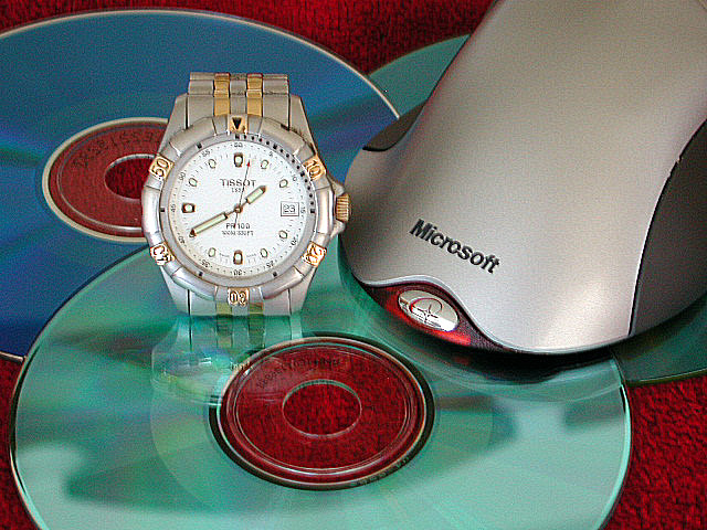
i really like the composition but i find the background color really doesn't go with the other colors. something more simple would probably have enhanced the picture greatly. mag99
Title? I think it resembles your photo, a bit jumbled. I would call this a little bit of a reach for this challenge. The photo is well taken. The focus is pretty good (the watch face seems "off" just a bit. Framing is too much of a personal choice to me, I prefer to not cut off subjects, but this is acceptable. I like the reflection of the watch in the CD. I'm not crazy about the carpet, but you make due with what you have on hand. As a just plain photo, it's about a 7, as a challenge photo, about the best I can go is 5. Swash
I like the colors in this, and the idea is good. I think, however, you almost have two separate pictures going on. I would have preferred it without the watch. karmat
7:- It is a well set up photograph that shows the topic matter in a fairly good way. I think however that the photo it a bit blurred, where the camera has been moved or something, and it has tried to be sharpened in photoshop, although that adds a horrible grain to the photo.







 Add photograph to your favorites
 Add photographer to your favorites


 Photographer found comment helpful.


