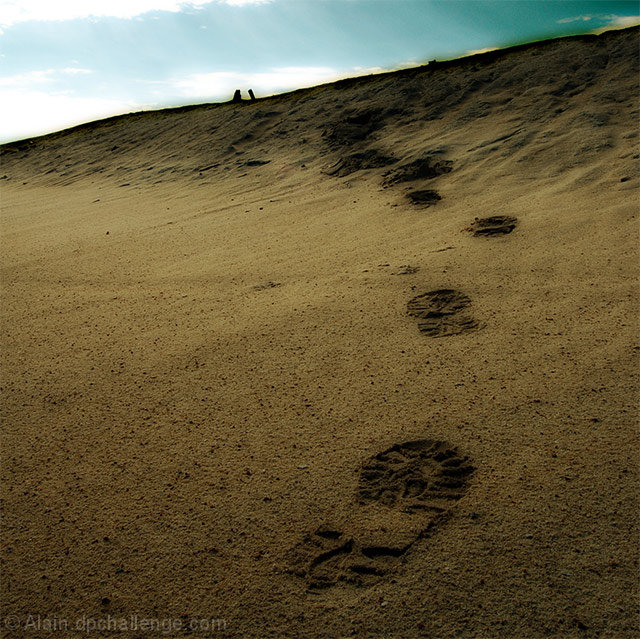
Ever since this challenge started, I had this idea in mind. I went to the only place around my place that looks like a desert. I made the footprints and then took many pictures at different angles. I liked this one.
Rotated
Cropped
Auto Levels
Dave's Midnight Sepia Action
Used Paint With Light Action to darken the sky
Saved for WEB
Statistics
Place: 23 out of 107 Avg (all users): 6.2558 Avg (commenters): 7.0714 Avg (participants): 5.7797 Avg (non-participants): 6.5044 Views since voting: 884 Views during voting: 321 Votes: 172 Comments: 15 Favorites: 0
Not sure if there was any need for the Victorian gothic histrionics in the processing. I say this because the line between beach and sky is a major part of this picture and you've ruined it with the sharpening etc. It's a great composition and it is suitably moody, but the sky is messed up and so is the top part of the sands. you should either have toned down the processing or shot it so it would stand up to the kind of processing you wanted to do. I have nothing against this kind of enhancement, it's just that in this case I feel it's ruined what could have been a great shot.
Just my opinion, and quite possibly not worth listening to, but it's only fair for me to tell you why you dropped a few points for me. Oh and if you didn't mess around with it in the processing, then I apologise, but it still looks messed up.
Ah Hah! Great thought! The shoe pattern even looks like the pattern on the ones I was wearing. Get a storm blow through tho and all those nice prints in the sand are either blown away by the wind or swept away by monsoon rains. - Steve
looks like midnight sepia processing. Or gaussian blur. Except for the slight funky at the top right from the processing, I like this image. I think the footprints make the image (many people don't consider adding a 'human' element). Well taken.
Great way to tell a story that fits the challenge theme and you've done it without being cute with additional steve faces, etc... The PP you've done on this works quite well - nicely composed, and nice use of leading the viewer thru the image. Good luck in the challenge.
I really like how the footprints lead you into the scene. :) However, the top-right corner of the frame looks overly-burnt to me. Nice tones in the sand, but I think the sky could have benefited from a hue/saturation adjustment or possibly a complete desaturation of the sky. Great concept though. :D






 Add photograph to your favorites
 Add photographer to your favorites


 Photographer found comment helpful.


