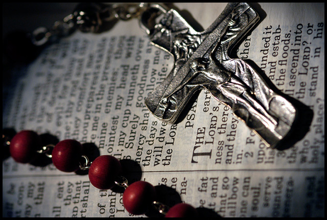
Two photos in the same challenge with the exact same title and the same concept what a coincidence, anyway I like the idea the text of the bible for a background seem to feel a bit busy, maybe if it had been rotated so it could be read, also the glare on the crucifix is a bit distracting.
I like the title... so true. Good composition in my opinion. Blurring around the edges might be considered good by some, not so good by others. That DOF gets pretty limited with macros.







 Add photograph to your favorites
 Add photographer to your favorites


 Photographer found comment helpful.


