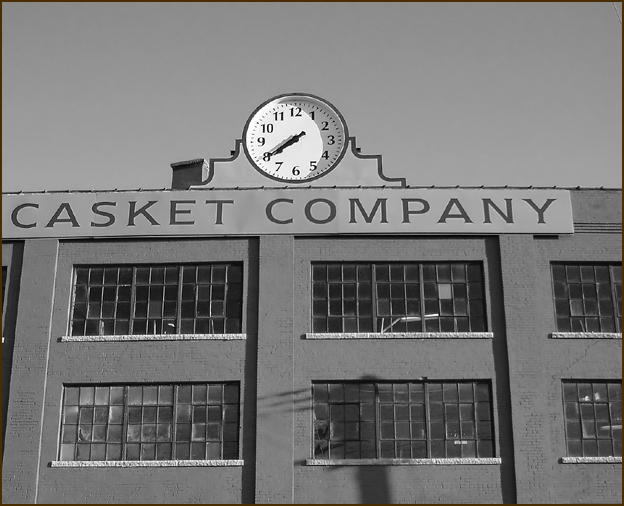
Actually I messed up - I had more cropped on the right than this version. This was the one I'd stopped working on.. *shrug* It happens. It says life to me.
Too bad people just considered the technical part. I still think this was the best one for the theme. If you pay attention to those small details that were commented on, you should do very well. It does bother me that the buildings are converging downwards, but that's only nitpicking.
LOVE IT! One of the most original shots of the whole set! How ironic as well. Too bad you didn't crop a bit more on the left. The sign that runs out is very distracting.
Very Emotive shot. There are alot of distractions that take from this. the light pole? shadow, the sign running off the image to the left, the crop on the right. I give this a six just the same because it does speak of life to me.
Unique idea! I like your photo a lot, but my eye is drawn to the bare bit at the right where the sign just ends. Cropping this so that there's more focus on the clock and sign would make it a stronger shot, for my taste. Hope this helps. Just the same, am very glad I got to see this.
Could have been more centered but great concept for the challenge - life does end in death, but time goes on, so somewhere in belief, life is everlasting. 10
I would think a little more cropped of the right to make it more symmetric would improve the photo. Nice idea of watching a clock on a casket company :)
Is my time up?





 Add photograph to your favorites
 Add photographer to your favorites

 Photographer found comment helpful.


