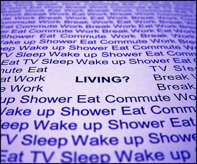
Freehand shot without flash of a white page with laser printer lettering. Played with Color Balance and Brightness/Contrast on Photoshop until I got the bluish - purplish color I was looking for. I also cropped a little around the edges to draw the eye even more towards the center element.
This shot was a complete experiment and I have no idea how it will fare. Damn the torpedoes!
Statistics
Place: 79 out of 231 Avg (all users): 5.2727 Avg (commenters): 6.3750 Avg (participants): 5.0636 Avg (non-participants): 5.4818 Views since voting: 1104 Votes: 220 Comments: 10 Favorites: 0
I hate to be mean, but I've seen this setup on DPC quite a few times now, and it's starting to become pretty unoriginal. The advice seems to be to overexpose a few stops when shooting white paper, so your text stands out better and the contrast is improved. The particular text used for this challenge is a nice touch though. Perhaps you could have used these printed words from a different viewing angle, or doing something different with the paper? I think it's a shame that there's a space around the word 'LIVING?', I'd have prefered the rest of the text right up to it, perhaps 'LIVING?' could have been in another colour. 5





 Add photograph to your favorites
 Add photographer to your favorites

 Photographer found comment helpful.


