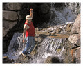
So, this idea, thought up with an hour and a half left to go in the challenge. I wish it was advanced editing so I could remove those darn shadows.
Humour does terrible on this site normally, so... here we go.
My prediction: 4.827
Post Challenge:
So I edited and uploaded this image on my friend's computer. His moniter was calibrated very differently from everyone elses, so yea, I wasn't as pleased with this shot, but I am pretty happy with the outcome.
Statistics
Place: 50 out of 99 Avg (all users): 5.3489 Avg (commenters): 6.4000 Avg (participants): 4.8974 Avg (non-participants): 5.4113 Views since voting: 1287 Views during voting: 779 Votes: 321 Comments: 12 Favorites: 1 (view)
Composition: The composition is good. I like the dimensionality it delivers. I do feel you needed just bit more on the bottom. The female model's outfit has a knot tied to her top that get's cut-off and kinda distracts. But other than that, good comp.
Subject: Fun subjects. Cute sexy female. Very expressive male. And well...a fish. There is a button that the male model is wearing that greatly distracts IMHO. But that's about it.
Technical (Colour, focus, and light): Okay, this is where I've got to knock the photo a bit. The colors are bright the blue works nicely, but the faces and skin tones come across far to red. Perhaps some selective de-saturation of the reds.
The lighting fades nicely. And does well with the shadows. However, there is a lot of noise and I feel the image could be sharper.
Creativity: Definitely points on this one for creativity and humor.
It is my hope that these insights are helpful, and constructive. If you have any questions regarding this critique, please feel free to PM me. Also feel free to PM me with any feedback on this critique. And please remember to mark it "Helpful" if you found it so.







 Add photograph to your favorites
 Add photographer to your favorites

 Photographer found comment helpful.


