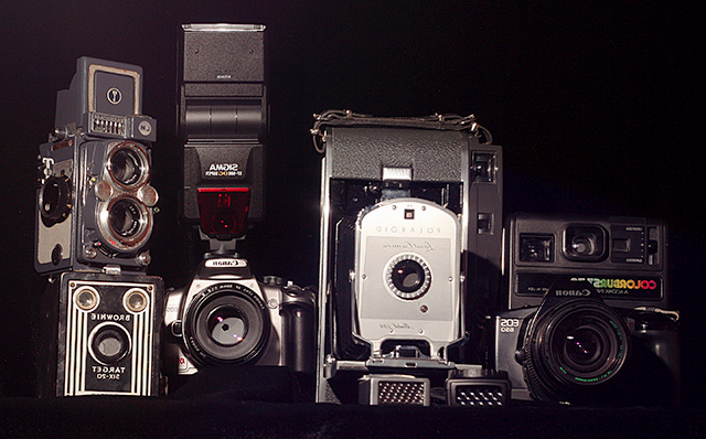
voted this with a 4. i think the "1920's style" concept would have been more effective if it was monochrome, or sepia or somesuch. it also feels a messy photograph in terms of set up, and lessens the impact as a result. maybe having fewer pieces of kit in the frame (such as just the two canon SLRs?) might make it more balanced. it also feels tilted, and the sigma flash looks odd pointing upwards. there just feels to be too much here.
Nice collection you have, the old Polaroid is really nice. Looks to me like this could have had a little better lighting to bring out more of the details.






 Add photograph to your favorites
 Add photographer to your favorites


 Photographer found comment helpful.


