To be perfectly honest, this was a shot that just didn't hole my attention long enough to try and figure out what you were getting at. After reading your comments, I trust you were pleased with the outcome, but I still could not see exactly where you were going with it. I guess in some ways that is the purpose of an abstract piece, and in that respect, you did well.
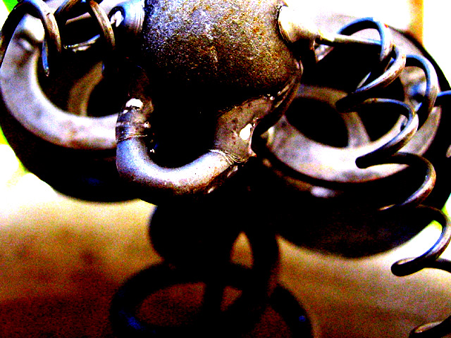
I think compositionally, if there had been more of the subject in the shot, perhaps lower and to the left, it would have seemed more balanced to me. The spring, or whatever the coil is on the right, is interesting, and provides a natural resting spot for the eyes, then leads them up and down, so perhaps that could have been given a more prominent role in the picture.
I think if you could have gotten the colors, etc. that you have without the extra noise, it would have been better. As it is, it kinda looks like you post-processed excessively to cover up some inherent flaw in the picture.
I know it sounds like I am totally downing your shot, but I promise that is not the case. This is the kind of shot I would show my English students and have them do a creative writing assignment on. As a photograph, it just doesn't appeal to me personally, though I do think it is an excellent example of abstract that causes people to wonder, adn leaves things open to interpretation.
I'm actually very happy with all of your responses. Even the negative responses acknowledged the effect I was looking for.
For those of you who had asked about it.
It's not as close as you may think. It was a 5 megapixel picture of a steel lawn sculpture that is a mouse. It was cropped at 640x480 almost exactly without having to resize it. After I had cropped the picture of the mouse to get the most interesting picture, I discovered the cold blue tones in it. This led me to play with the contrast, brightness, and color till I got just the right tonal image I wanted.
I called it the mouse trap because it's a closeup picture of the steel mouses and with all of the springs and such, it reminded me of a broken mouse trap. If I hadn't called it mouse trap, it would of been called cold blue steel, but I figured mouse trap was a better name after some debate as cold blue steel would have implied a crisper and sharper image.
Interesting piece. The noise helps to add a edgy mood to the picture. You can't keep your eyes off of it. You can's help but wonder what or how it works.
Very colorful. I'm sure you're right and this is a mousetrap, but there's such a thing as too close? (W/O the title, I would have NEVER guessed) Seems like too much saturation as well, makes for cool colors, but increases the grain, too.
6 Rob the Swash





 Add photograph to your favorites
 Add photographer to your favorites


 Photographer found comment helpful.


