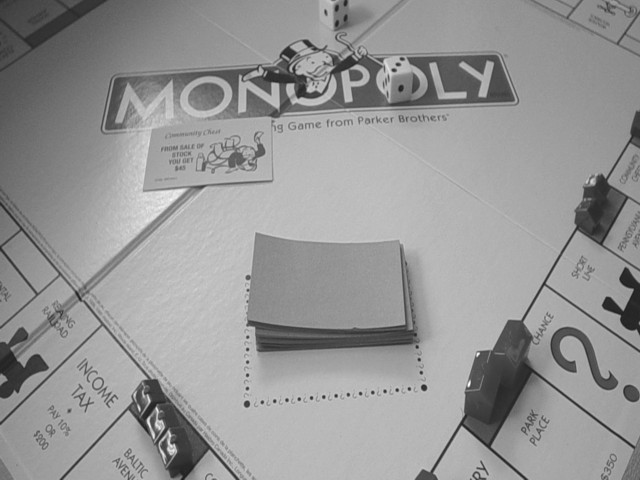
Not a bad choice for black and white, but isn't it more recognizable and attractive in color? The light flare on the M, makes the Community Chest card harder to read. Minor nit: notice the copyright sign next to the manufacturer's name? 5 Swash
Something about how this is framed feels a little off to me. You have two lines that connect near the top middle, maybe if they were more off to one side and down lower. i like the black and white. karmat
This is my winner - it's witty, it covers the subject and I really love the way nothing is lined up. The purist may moan about glare and sharpness, but I'd poo, poo that, I think it adds to overall effect. Grat picture, good luck...
I don't know if you made this deliberatelt dark to go with the Challenge title but I don't care for the greyness of everything especially those bits we know are white e.g the Monopoly name. No doubt you will get comments about sharpness with this image. I have no doubt the original was pin sharp but this version suffers from the fuzzy edges caused by JPEG compression. It could be fixed a little by using the sharpness tool in photoshop or similar. If soft focus was your aim then I apologise but I doubt it was, you wouldn't have put that single card face up in the image if you didn't mean us to read it and unfortunately I can't.
Good concept and execution but I think you could have got in closer and perhaps pushed the contrast a little further. A stronger light from the side would have added drama too.







 Add photograph to your favorites
 Add photographer to your favorites


