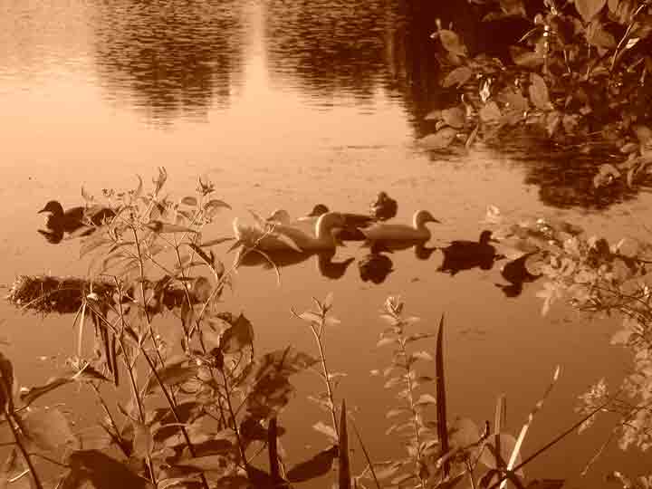
Taken with Sepia Tone using a Nikon Coolpix S2 (not currently in photo category) in the evening at a local lake while out exercising. No special set-up other than near eye level, no post editing, and no tripod. I like spontaneous landscape photographs.
Thank you for your comments regarding the pixel quality. I was not saving the images to the web properly. I have since read the uploading instructions on DCP, PSE, and adjusted the lighting on my monitor.
Statistics
Place: 675 out of 684 Avg (all users): 3.7992 Avg (commenters): 3.4348 Avg (participants): 3.7098 Avg (non-participants): 4.1071 Views since voting: 760 Views during voting: 317 Votes: 249 Comments: 24 Favorites: 0
After the chalenge, feel free to contact me by PM on preparing an image for a challenge. This image has been compressed so much that there is a lot of "jaggies' and compression artifacts. The file size we were allowed was 200kb, and see yours here was 22kb. Not real keen on the overall tone either.
I like the idea but the sepia tone does not work here and the birds are a bit out of focus. The composition is good but it would probably would work better if it was in color or if you had more contrast in the sepia tone.
This photo breaks all the rules: poor focus, dead center subject, oversaturated color. Yet it somehow works, giving a dreamy feel that nicely portrays Saturday at the Lake. But a little too much jpeg compression I think; the artifacts distract from the overall feel.
Whoa. There are some serious compression issues here. Your shot is only about 20K when you could submit up to 200k for this challenge. The use of sepia seems gratuitous here, too, I'm afraid. I don't see how it adds to the shot; it makes it look like a muddy, dirty river.
Seems to be a bit odd-looking around top centre. Maybe something has happened in the resize, it doesn't look quite right. The rest of the photo has a nice dreamy effect to it.
Composition: 3 - Seems very cluttered with the main focus centered, which doesnt work here imo
Technical: 3 - The jpeg compression is way too strong. You had 200kb to work with in this challenge, but you only used 22. This results in artifacting and also it looking very soft.
Creativity: 3 - A different angle to make this more unique would improve it
Appeal: 2 - With the artifacts, softness, crowdedness, and also the way too strong orange colour, the photo doesnt appeal to me at all, sorry.






 Add photograph to your favorites
 Add photographer to your favorites


 Photographer found comment helpful.


