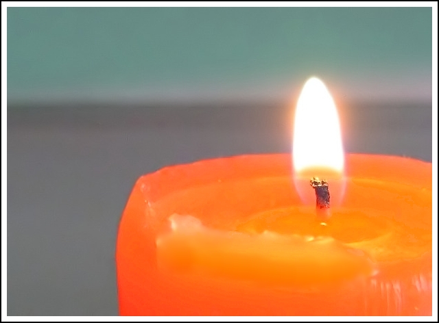
Nice simple image, I like the color of the candle and the way it contrasts from the background. I think I'd prefer if the background was all one color and if it was that light greenish portion, that'd really set off the tangerine of the candle. The main issue here I think is the focus. The wick seems to be fairly focused but the wax of the candle is much of a blurry lump that distracts me. If the entire, or really most of the upper portion of the candle were tack sharp this would've scored much higher for me. I feel the candle being such a large part of the image has a huge impact visually and thus requires more sharpness. The lighting both from the candle and from other sources (looks like more than one light source at work) is perfect. Everything that needs to be seen is visible. The composition is good, I really like that you have the candle coming out of the corner of the image. The border is a bit distracting, perhaps thinner or just purely black wouldn't draw my attention to it and away from the subject. Overall I gave a 5
Great title. I love the colors as well as the horizontal background and the overall composition. I think I like the candle being soft... maybe others would prefer it in sharper focus, but I think this image works really well when viewed in a more abstract way. There's a little bit of haloing that I notice around the candle - should try a larger file size if you can. I really like this image.
this feels a smidgeon over exposed, though it might be the background that gives that impression - just feels to light and bright really. there's also weird artefacts along the edge of the candle... i like that the wick is nice and sharp, and it does work to focus the eye on the flame in the first instance. but then my eye wanders around and there's not a lot to absorb. just doesn't really grab me, i'm afriad. sorry. 4.
Just a candle. The image is soft (OOF) and the background color in not nice. It doesnt complement the orange of the candle. But it does meet the challenge. 5





 Add photograph to your favorites
 Add photographer to your favorites


 Photographer found comment helpful.


