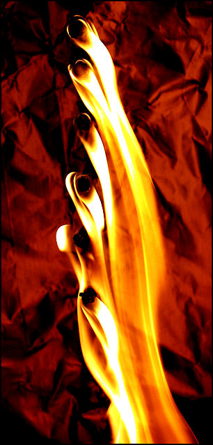
I think this is a neat little image. The composition is very nice. I like how the flame flows, and how each flame adds to the next. The exposure is nicely done. Also, the subtle detail on the flame heads (matches??) adds a nice touch.
The background color could maybe use a change. The contrast between the fg and bg is interesting like it is now, but maybe a more contrasting color like black or blue might have added a little "umph" to this image. I like the "crinkles"
I like this composition for the most part. Love the way the fire drapes and flows. The different nodules (are those matchsticks?) add a nice bit of uniformity to the image that also helps highlight the more organic feel of the fire. I do not like the background. It distracts me from the main subject with all its crinkle and creasing. I don't mind the color, though maybe a cooler color of blue or green might have added a better contrast and might not have distracted as much. Not sure. I gave a 5





 Add photograph to your favorites
 Add photographer to your favorites

 Photographer found comment helpful.


