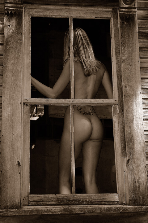
Ok this is strange, that tattoo looks very similar to another also in this challenge on the back of a nude female. Hmmm. Anyway, It is a nice shot the wood grain looks good, the tones look nice, except for the bright spot on our right it distracts my eye. As well as the spot under her elbo. For this type of shot, I think it would be better to have more of the window frame showing. This perspective/distortion to me doesn't hold enough entrest.
I don't normally rate nudes very highly on this site, not because I don't like them or appreciate them, but because they rarely appeal. This does however .. I like the through the window approach and the sepia toning really works well.
This is a very well executed picture and I like your decision to use a sepia tone. It adds an extra bit of softness to the feeling of the picture. I do not understand the title. If it is intended to be a pun than I do not feel it was necessary or suits the mood of the picture. The image really needs no title. Its beauty stands on its own.
sorry, couldn't resist... this is a great sensual highly charged image. i love the voyeuristic element of this, which somehow lessens the degree of gratuitousness is might have otherwise had. the sepia, level of noise and grain, and the lighting is also very nice and done to great effect. clearly, she's fit, which heightens the appeal of the image, but one thinks that with the artistic style and technical skill, the same would have been achieved if it were Jack Black. possibly. very lovely - 10.
I'm not scoring this photo with a high mark because of the attractive female body. I'm scoring it high because it's a well thought out photo - title and subjects (the house included which was an awesome addition), plus, it's a darn good photo!
When my screen loaded and I saw this, I thought "hey thats kinda cool, a great idea" and I looked down to click on 8, as I did that I saw the title,
and couldn't help myself buy laugh! I love it! 10







 Add photograph to your favorites
 Add photographer to your favorites

 Photographer found comment helpful.


