Cool picture. Only two things -- it seems to have a slight yellowish cast on the left side, and I think the phone needs to be in some and angled with the bottom going to the right. It looks like it is out of the frame almost, and that makes it seem unbalanced to me. karmat
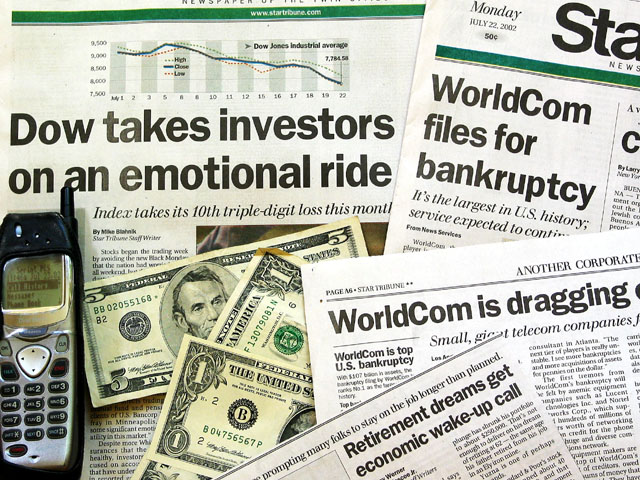
I almost wonder if setting them on fire might have added to the statement? The cell phone doesn't add much, but it could have if it had a stock quote or a broker's number displayed...
This is more to the challenge subject than most, but it seems a bit overly jumbled to me, too many elements (I guess it's just me). Who are you going to call? (joke ans: GHOSTBUSTERS!) Clarity and lighting are top notch. Interest is at a good level, but see jumbled. Two pairs is your best liars poker hand. (get it?) Started as a 7, but have talked myself up to an 8. Swash
Technically, a great picture - but I'm put off by the fact that it looks a bit thrown together. I can't fault exposure and lighting, put composition seems a bit haphazard. I think I would have scored higher if the phone were a central feature – but hey, I'm no pro; good luck…
Very well done. If I was to nitpick one little thing, did you crop so close on the phone on purpose? It feels kind of tight to me... But certainly this is VERY well done
The only thing missing are the keys to a Porsche! Good lighting. I think in the composition, that it would have been more interesting to shuffle the items around a bit tighter so that more of the headlines were only partially visible, leaving the imagination to fill in some of the blanks.
I think the idea, no matter how cliche, is nice. Something that bugged me was the color of the newspapers getting whiter nearer the bottom right corner. So, it's a mixture of proper organization and discoloration, which tends to leave a bit of a bad taste.







 Add photograph to your favorites
 Add photographer to your favorites


