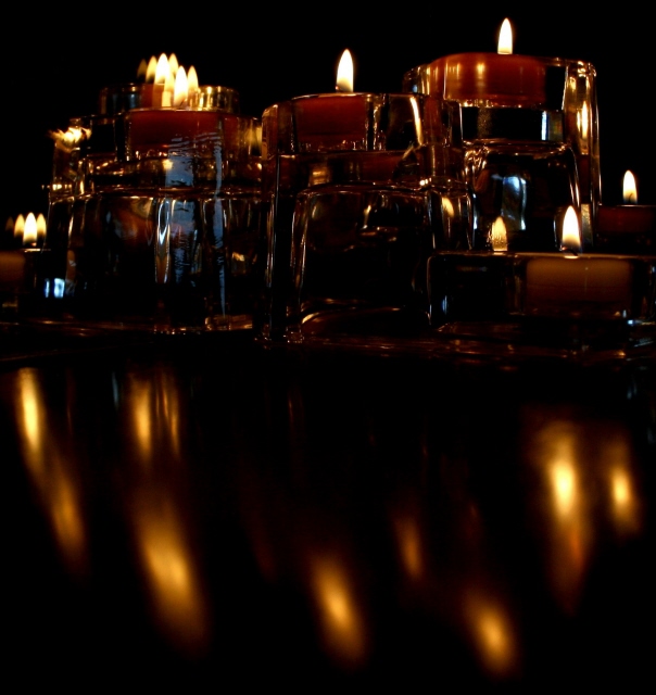
I didn't vote in the Fire II challenge so this is the first time I've taken time to look at your image critically. Overall you chose a very strong subject for this challenge that should have scored higher than the five that it did. This would indicate that there were technical or compositional issues with your image. It is my belief that the primary issue was compositional. My first impression when I looked at your image was "Wow, there is a lot going on in this picture". In your image there are two primary focal points competing for the viewer's attention, the side reflected candles on the left and the back reflected candles on the right. Since the back reflected candles are more aesthetically pleasing than the left reflected candles, this image should have been cropped to eliminate the reflected candles on the left. You might want to consider using a square crop to eliminate the reflections off the shelf as well, as these reflections also compete against the wonderful grouping of candles on the right.
Feel free to PM me if you have any questions regarding this critique.
I like the image as it is, but would be very interested to see how it might look with the reflection part cropped off. I know the reflections are sort of the point, hence the title, but I just *adore* the top part of the image and think it could do very well on its own. Not marking down or anything for that though, just would be curious to see.
i'm guessing you also has a mirror behind the candles, because there is something very odd going on with the candles at the back left. i'm also guessing you might have had some preconceived ideas about what you wanted to achieve, and i think the picture suffers as a result; the desire to include the reflections in the bottom half doesn't really add to the overall picture - i think i'd have cropped it out entirely. it's also giving the illusion of being wonky (which voters never like because it's usually the first thing they see), and it's far too dark; i think some additional lighting (like a typical flashlight) rather than a longer exposure might have helped, because the way you've set the candles up is really nice, almost like a city skyline. 4.
I see the idea. Yet the composition feels crowded to me and I dont know where to look. The reflectons of the flames are everywhere and the mirror and glass make the flames dull. It meet the challenge 5
The composition is a little chaotic with no one place for my eyes to stop. It's not very abstract but it's hard to know what you're looking at so the mind is just a little confused. Maybe one candle or a different angle. Not really sure.





 Add photograph to your favorites
 Add photographer to your favorites

 Photographer found comment helpful.


