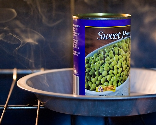
I think this photo was a good idea but I think the execution could use a little work.
First, I think this photo is pulled down with all the dark and drab colors in the background. Nothing really pops in my opinion. The image seems too busy and my eyes just go all over the place, only to lead back to the piles of peas depicted on the can.
Second, the use of your elements along with someone else's picture on the can is sort-of making this image fall short of the mark. The angle is unimaginative.
The focus is really sharp though. With a little more work you could have a really great image.






 Add photograph to your favorites
 Add photographer to your favorites


 Photographer found comment helpful.


