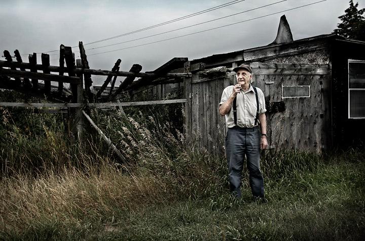
This is Albert Smith. Each year we visit him because he cuts our firewood.
We always guess how old he is, cause he looks about 100, but I asked and he is only 65. He is a chain smoker and I guess this has aged him so much.
He's a nice, simple man and requested some copies of the pictures I took of him. He didn't mind standing there while I snapped off some shots. He is smoking a cigarette in this image, but you can't see it due to the web res. I'm going to make a huge 24x36 print to hang in my home so I can always remember the Wood Man and his little shack.
Statistics
Place: 52 out of 684 Avg (all users): 6.3874 Avg (commenters): 7.5455 Avg (participants): 6.3731 Avg (non-participants): 6.4423 Views since voting: 2713 Views during voting: 390 Votes: 253 Comments: 30 Favorites: 3 (view)
Agree with metatate and eschelar, I didn´t give those wires a second glance really and they blend in very nicely with this shot, mostly cause of good composition. WIthouth wanting to mean this personally against anyone I think it´s just very "DPC like" to dislike wires and telephone poles cause it´s the norm, it´s like having a blown highlight or a slanted composition, easily identifiable and easy to comment on and has been branded somewhat undesirable. I like the wires and glad you didn´t edit them out.
Anyway dude, in web resolution a good shot, have a feeling it will look great in 24x36! :)
I agree - since the lines follow the angle of the building I think with this crop the lines actually balance it out compositionally and metaphorically.
Originally posted by eschelar:
I don't know why everyone is so afraid of wires. I think the wires are just fine in this shot. I think they are OK primarily because they work well with the lines existant in the shot.
I don't know why everyone is so afraid of wires. I think the wires are just fine in this shot. I think they are OK primarily because they work well with the lines existant in the shot.
I find though that the shot is actually missing some detail in his face... I wonder if perhaps this is also due to the resizing... resizing from a P&S is a far cry from resizing from a 12MP 5D...
it's still a highly worthy shot in pretty much every other way though.
I really like the look and feel of this photo. The colors and textures present give it an earthy & grungy feel that gives a really moody feel. Even though the house appears run down the man stands there and one gets the feeling he is comfortable just we he is - it is his home after all which is what the title of the piece communicates to us. The only critique I have for the this photo is that while it shows the realism of the place, those telephone wires do nothing but distract and detract. I know some would clone them out and perhaps that might be an option so that they do not draw attention away from the main focal points of the photo.
amazing photo, love the added effect here...the coloring is very good...the composition is great...and his expression is what makes this shot even more! 10 and adding to faves!
this processing is too "in my face" for me to enjoy anotherwise excellent photo. He looks almost like a cardboard cutout - or a composite that has yet to be color and gamma matched into the background scene.
While doing all that processing, I would definately have taken the distracting power lines out too.
Hope that helps you see why I didn't give this a great score - 5







 Add photograph to your favorites
 Add photographer to your favorites

 Photographer found comment helpful.


