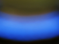
Challenge:Fire II (Advanced Editing IV) Camera:Sony DSC-F717 Location: studio Date: Aug 10, 2006 Aperture: f2 ISO: 100 Shutter: 1/30 Galleries:Macro Date Uploaded: Aug 10, 2006
erm. yes. good depth of field, nice to see rule of thirds being applied so well....
i don't know. it's a bit, you know, a bit tooo abstract, perhaps? maybe? it's a nice blue. very bright. might have used the burn tool in the top left a bit. i think you could do with a nice border to set it off. i'm guessing it does actually meet the challenge. so 2.
Wow, gorgeous gradient. The only problem I have with it is the texture to the bottom right - at first glance, it looks more like noise or pixel distortion due to compression, rather than what I'm sure must be the surface under the flame. Original take on the challenge, I likey, but suspect many others may feel differently.
The color gradient is nice, but noisy. And how do I know this is fire? I'm generally a fan of macro and abstract, but I honestly can't tell that this is a blue flame. Such doubt will kill your score every time.
Blue Fire Huh? Well I am sure that somehow this meets the challenge. It is not so obvious to me but I will give you the benefit of the doubt. But compared to the other images in this challenge I can't give you anymore than a 3.
This is interesting, very abstract. If there were just a bit more of a sense of WHAT it is we're looking at, I think it would go over better. But as it stands, it's just a blue gradient, which leaves me clueless and wondering if the subject even fits the challenge.






 Add photograph to your favorites
 Add photographer to your favorites


 Photographer found comment helpful.


