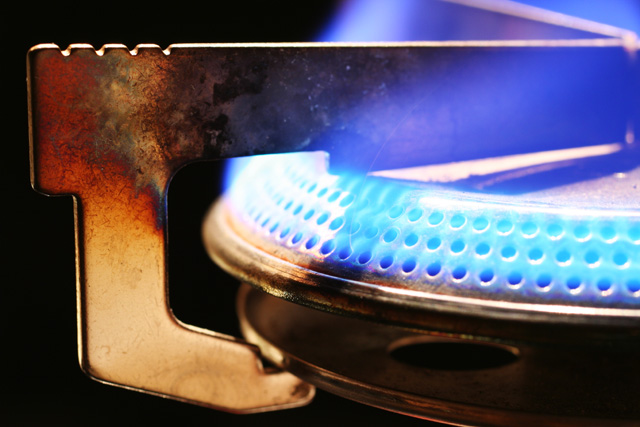
The composition here is a bit cluttered. There are too many places to look and so my eye rests on the one sharp line it can find, which is at the furthest point from the flame (upper left corner of the metal bit). In a fire challenge, shouldn't your eye be drawn to the fire?
It's neat to see an image with blue flame instead of red/orange/yellow. I like the pattern of colors on the left corner of the metal - but unfortunately, the beauty of it distracts my eye from the flame. I think that could be just me, though; I think overall the composition is good.





 Add photograph to your favorites
 Add photographer to your favorites


 Photographer found comment helpful.


