Challenge:Free Study XII (Advanced Editing IV*) Camera:Nikon D70 Location: home studio Date: Aug 9, 2006 Aperture: f4 ISO: 400 Shutter: 1/1000 Date Uploaded: Aug 9, 2006
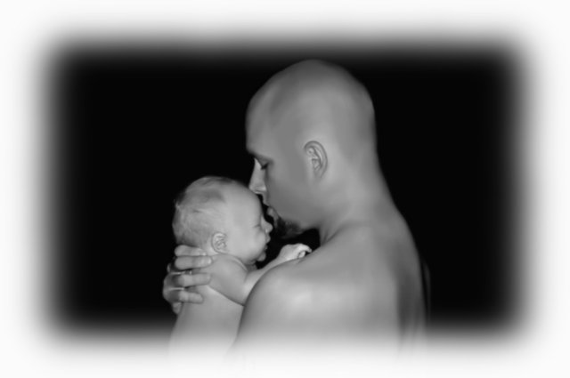
Absolutely wonderful composition and I absolutely love the choice (and execution) of the BW tones. A moment worth saving! However, ahem, the border is IMO, woefully miscalculated. Terribly distracting from what otherwise would have been a memorable portrait.
Not fond of the border - it kind of overshadows the picture because it's so thick. Same thing only much narrower might work. The picture itself is very sweet - I like that the son has more hair than the father.
OK..> here we go...I want to be kind, so I will say congrats on the baby...but the photo is not good :-( sorry...
the vignetted frame is terribly distracting and the neat image has made things plastic...I am not sure, but without the frame and a better crop and no neat image, this would have been much better
I find the frame too wide and very distracting from the quiet mood that could be had with father and baby - the central composition is static and fighting for attention with the frame - maybe a vertical presentation or at minimum most of the right side cropped off - is a sweet picture of the two of them but the post processing and composition doesn't do them justice
I really dont like the feathered frame, it just makes the whole picture seem soft, and draws attention away from the subject, I think cropping to a portrait orientation would have been much more effective







 Add photograph to your favorites
 Add photographer to your favorites


