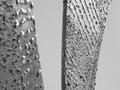
Detail of a stone "plaque" (for lack of a better word) on the side of Alter Peter, or the Church of St. Peter in Munich. This plaque is probably over 500 years old. The inscription is in Latin.
Statistics
Place: 121 out of 218 Avg (all users): 5.1063 Avg (commenters): 5.5000 Avg (participants): 4.9167 Avg (non-participants): 5.4082 Views since voting: 1241 Votes: 254 Comments: 35 Favorites: 0
Im kinda horrified that so many comments criticise the lack of focus in this picture. The narrow depth of field was clearly intentional in this shot and I, for one, love it. Loads of drama in what could have been a very staid image.
there were a handful of shots this week that i think just completely went over the head of the people voting on this site. this was one of them. it's one of those things where most people just looked at it and were like "blurry and i don't know what it is" and automatically gave it a 4 or 5. this is a very artistic shot and has a lot of great merits. i gave it an 8, which is very high for me (i only gave 1 shot in this challenge a 9, and no 10s), and i think it deserves another look by everyone who gave it less.
great shot. might benefit from a little more depth of field, but the soft focus in the foreground doesn't bother me too much. great subject and a nice angle. love the muted colors and texture. good work.
I would've made sure the foreground was in focus in this image. Even with that however, it wouldn't be very interesting to me. It would need more context. 4 sjgleah
This is such a great idea. Was the blur in the lower right corner intentional? I hope not, I don't like it. A wider depth of field, or backing away just a little might have helped. Are the letters colored? High angle attack shots create nice interest, but also create focal range problems. I think I would have been happy to see this more straight on. 6 Swash
Composition5 Originality5 Technical Aspects4 Meets Challenge6 Total Score5
For those that are just learning, like me.
Composition: Scoring in this area is based on basic composition of a picture and includes the rule of thirds, balance, cropping, and curved and diagonal lines. Subject matter that does not lend itself to the picture or otherwise unwanted is also considered here.
Originality: Scoring in this area is based on pictures or concepts that I have seen, as well as how much effort you have invested in the picture. Usually a little something that sets it aside from a snapshot. Does it make me want to come back for another look? You know things like that.
Technical Aspects: Focus, exposure, lighting, and other special effects (done by the camera), and post processing are all considered in this category.
Meets Challenge: This is based on my interpretation of if you, have/have not, met the challenge. This is fairly simple but quite important for this site.
There are many sites that can give you assistance in achieving better skills in photography, but I think the best way to learn is to take pictures and show them to other people. Believe me when it is a good one you will know it.
Neat subject for this challenge. I know probably everyone else is saying it, and you probably already know anyway, but it would be nicer with a bit more depth of field in the foreground. May or may not be within the limits of your camera though.
okay, where to begin...first off, i like it a lot! i couldn't have done it better. secondly, what a representation of texture. thirdly, great composition
I find that this has good exposure, but the blur in the foreground is excessive and throws me off. I suggest a higher f/stop for increased DOF and/or get the foreground in focus.







 Add photograph to your favorites
 Add photographer to your favorites


