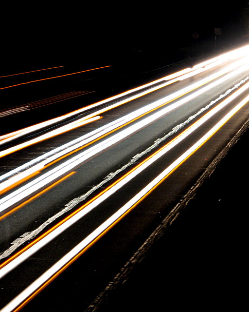
i'd have cropped this more square from the bottom, keeping the same width. the brighter lights in the corner are a major distraction, and the top left orange lights don't really fit in. otherwise, it's a reasonably striking abstract shot; and the title is a rather lovely choice. but for me, overall, it leaves me a bit cold. sorry. 4.
This is one of those ideas that has been done so many times that you have to do something pretty amazing to impress people with it. I wasn't awed. Sorry. =(
Nice effect! Funny, I almost entered something quite similar - or at least same idea, but I went for something totally different in the end. I like the sharp division between the stark white and strong yellow lines. I'm not crazy about the upper right portion of the image, but it could be that if I stared at it much longer, I'd grow to love it ;-) The angle is another thing I like.






 Add photograph to your favorites
 Add photographer to your favorites


 Photographer found comment helpful.


