This was an absolute last minute photograph, which required a drive to Dallas with less than 3 hours remaining. I had it planned, but didn't do it 'til almost too late.
Statistics
Place: 9 out of 218 Avg (all users): 6.4458 Avg (commenters): 7.9189 Avg (participants): 6.4516 Avg (non-participants): 6.4362 Views since voting: 2297 Votes: 249 Comments: 39 Favorites: 0
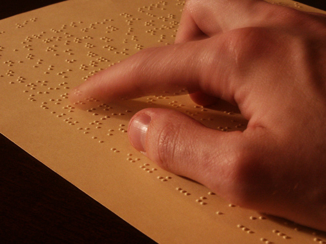
Thanks for all the great comments on this. It was a fun shot to get and most people seemed to understood it. "Gotcha" got it the most (coincidence) - I was intentionally trying to capture in low light, as a visually impaired person doesn't need the same lighting that others might. It came out a bit on the yellow side (though the paper really is yellow). I probably should have adjusted the whitebalance a little more to see if it would reduce the yellow some and still give the same effect. This photo was unaltered in Photoshop aside from a little cropping to get rid of a crease in upper right side of the paper.
Very original and I like it. Even the movement of the finger illustrates the process. I'd like to see some of the yellow removed from the overall pic though.
Mom use to tell me I shouldn't read in low lighting like this. My first impact impression of this was that the lighting is a little incandescent for my taste...... but after pondering.. it sets this capture up perfectly giving the suggestion that brighter lighting would only benefit those of us who see. - great job, nice finger movement while maintaining clarity in the hand. - 8
VERY good picture. I'll be dissapointed if it's not in the top 20. I mean, you must be DAMN good if you your blind and can still take decent photos! LOL
This is an excellent example of texture... the composition is also very nice. The motion blur in the finger really adds a great touch to this one :) The only thing I don't particularly like in this image is the yellow tone of the paper. Is this the natural tone or is it in need of a white balance adjustment? good work :) = 7 - jmsetzler
I like this lots. Texture is a feeling... with the fingertips. Some photos give you a feeling of texture with your eyes. This conveys the true feeling of texture by "seeing" with the fingers.
Composition10 Originality10 Technical Aspects9 Meets Challenge9 Total Score10
For those that are just learning, like me.
Composition: Scoring in this area is based on basic composition of a picture and includes the rule of thirds, balance, cropping, and curved and diagonal lines. Subject matter that does not lend itself to the picture or otherwise unwanted is also considered here.
Originality: Scoring in this area is based on pictures or concepts that I have seen, as well as how much effort you have invested in the picture. Usually a little something that sets it aside from a snapshot. Does it make me want to come back for another look? You know things like that.
Technical Aspects: Focus, exposure, lighting, and other special effects (done by the camera), and post processing are all considered in this category.
Meets Challenge: This is based on my interpretation of if you, have/have not, met the challenge. This is fairly simple but quite important for this site.
There are many sites that can give you assistance in achieving better skills in photography, but I think the best way to learn is to take pictures and show them to other people. Believe me when it is a good one you will know it.
Braille, cool, this picture is totally appropriate and the motion blur makes perfect sense. The cropping is a little too tight for my tastes; I want to see all of their middle finger. I am also a little uncomfortable with the levels and color balance, almost as if the white balance was set to daylight when indoors. Overall a good photograph, one of my top ten picks this week.
great shot, including the movement blur, DOF, colors, composition. on a side-note: I don't think the title is very appropriate - or do you know seeing people who choose to read braille when there's no light? 8 beegee
Neat idea. I like the way you can see through parts of the hand. The color isn't really very pleasing to me, though, for some reason...maybe the skin tones?
Great idea and picture. The slight blur is effective, I think, because it gives the impression of active reading. There seems to be a slight yellow tint (other than the paper), but I will assume it is on my end. Great picture. So far, my favorite. karmat
Excellent interpretation, superb execution. My only complaint is that the combination of the moving finger and long exposure create a ghosted effect (it looks like you can see the braille through the finger) 9-ClubJuggle





 Add photograph to your favorites
 Add photographer to your favorites


