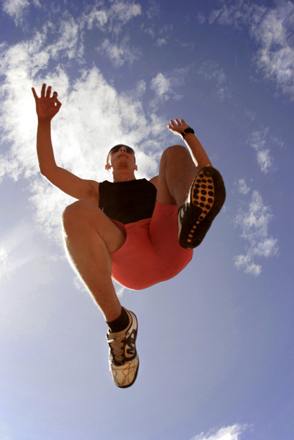
Hello from the Critique Club. I thought you picked a very good subject for this challenge and I gave it a 7. The issue with shooting into the sun is that the colors of your subject tend to look flat. This image could have used a bit more saturation to make the jumper stand out more. However, just bumping the saturation would have made the jumper's skin look too red so you would need to play around to determine which colors to selectively saturate (Blues and greens probably).
If you have any questions regarding this critique, please feel free to send me a PM.
Tim
Message edited by author 2006-08-22 11:52:48. |







 Add photograph to your favorites
 Add photographer to your favorites


 Photographer found comment helpful.


